Summary and intuition
A trade-off mediated by the number of treated observations
In the case of studies using exogenous shocks, a confounding-exaggeration trade-off is mediated by the number of (un)treated observations. In some settings, while the number of observations is large, the number of events might be limited. Pinpointing exogenous shocks is never easy and we are sometimes only able to find a limited number of occurrences of this shock or shocks affecting a small portion of the population. More precisely, the number of observations with a non-null treatment status might be small (or conversely the number of non-treated units might be small). In this instance, the variation available to identify the treatment is limited, possibly leading power to be low and exaggeration issues to arise.
An illustrative example
For readability and to illustrate this loss in power, let’s consider an example setting. For this illustration we could use a large variety of Data Genereting Processes (DGP), both in terms of distribution of the variables and of relations between them. I narrow this down to an example setting, considering an analysis of health impacts of air pollution. More precisely, I simulate and analyze the impacts of air pollution reduction in birthweights. Air pollution might vary with other variables that may also affect birthweight (for instance economic activity). Some of these variables might be unobserved and bias estimates of a simple regression of birthweight on pollution levels. A strategy to avoid such issues is to consider exogenous shocks to air pollution such as plant closures, plant openings, creation of a low emission zone or an urban toll, strikes, etc.
Although I consider an example setting for clarity, this confounding-exaggeration trade-off mediated by a number of treated observations arises in other settings.
Modeling choices
To simplify, I make the assumptions described below. Of course these assumptions may be seen as arbitrary and I invite interested readers to play around with them.
Many studies in the literature, such as Currie et al. (2015) and Lavaine and Neidell (2017) for instance, aggregate observations to build a panel. I follow this approach and look at the evolution of birthweights in zip codes in time.
Here, I only estimate a reduced form model and am therefore not interested in modeling the effect of the plant closure on pollution levels. I consider that the plant closure leads to some air pollution reduction and want to estimate the effect of this closure on birth-weight.
The DGP can be represented using the following Directed Acyclic Graph (DAG):
Show code
second_color <- str_sub(colors_mediocre[["four_colors"]], 10, 16)

dagify(W ~ T + zFE + tFE + u,
       exposure = c("W", "T", "zFE", "tFE"),
       # outcome = "w",
       latent = c("u"),
       coords = list(x = c(W = 3, T = 2, zFE = 2.5, tFE = 2.5, u = 3),
                     y = c(W = 1, T = 1, zFE = 0, tFE = 2, u = 2))
  ) |>
  ggdag_status(text_size = 5) +
  theme_dag_blank(legend.position = "none") +
  scale_mediocre_d(pal = "coty") +
  annotate(#parameters
    "text",
    x = c(2.5),
    y = c(1.1),
    label = c("beta"),
    parse = TRUE,
    color = "black",
    size = 5
) 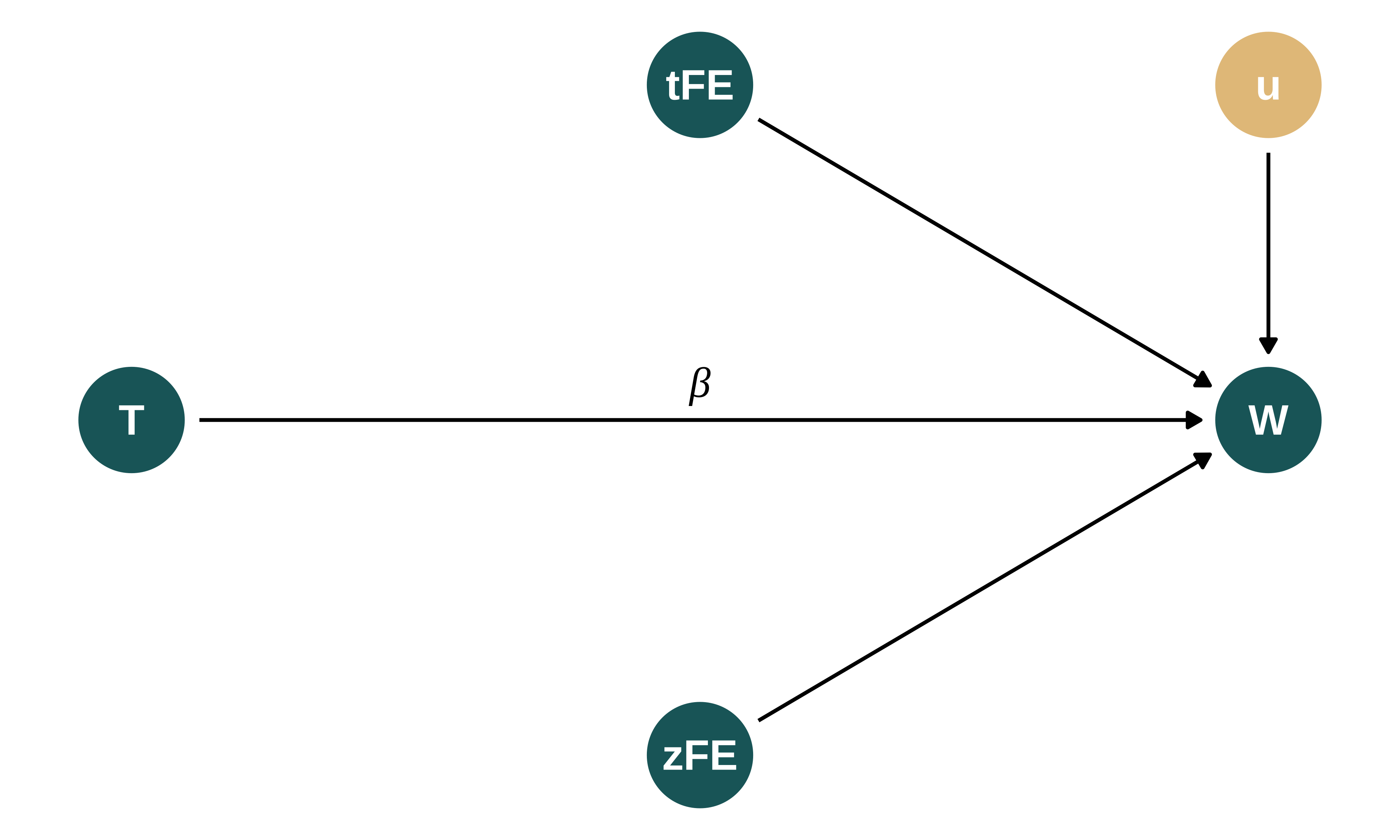
I consider that the average birthweight in zip code \(z\) at time period \(t\), \(w_{zt}\), depends on a zip code fixed-effect \(\zeta_z\), a time fixed-effect \(\tau_t\) and the treatment status \(T_i\), ie whether a plant is closed in this period or not. For now, I do not simulate omitted variable biases as I consider that the shocks are truly exogenous. Thus, birthweight is defined as follows:
\[w_{zt} = \beta_0 + \beta_1 T_{zt} + \zeta_z + \tau_t + u_{zt}\]
To simplify, I consider the following additional assumptions:
- Treatment effects are constant in time and homogeneous across zip codes. In this case, the two ways fixed effect estimation should yield a correct estimate of the ATET (as discussed in (de_chaisemartin_two-way_2022?) for instance)
- Treatment allocation is random. Both Lavaine and Neidell (2017) and Currie et al. (2015) consider very different treatment allocation procedures. In Lavaine and Neidell (2017), the treatment is a strike that lasts for one month, ie one time period, and that affects all treated zip codes at the same time. Not all zip codes are treated. In Currie et al. (2015), the treatment is whether a polluting plant is open near the spatial unit of interest. The variation in treatment status is arguably quasi-random as I simulated but lasts for more than one period. I mix both treatment allocation mechanisms and consider a random allocation of treatment across units. This is the “ideal” setting and thus a conservative hypothesis.
- A proportion \(p_{treat}\) of observations (a zip code in a given month) are treated.
- As in my other simulations, I simplify the data generating process and do not represent any spatial correlation. While this assumption might be particularly unrealistic, it goes into the direction of facilitating the retrieval of the effect of interest and is therefore a conservation modelling assumption.
More precisely, I set:
- \(N_z\) the number of zip codes,
- \(N_t\) the number of periods (months),
- \(\zeta_z \sim \mathcal{N}(\mu_{\zeta}, \sigma_{\zeta}^{2})\) the fixed effect for zip code \(z\),
- \(\tau_t \sim \mathcal{N}(\mu_{\tau}, \sigma_{\tau}^{2})\) the fixed effect for time period \(t\),
- \(u_{zt} \sim \mathcal{N}(0, \sigma_{u}^{2})\) some noise,
- \(T_{zt}\) represent the treatment allocation, it is equal to 1 if zip code \(z\) is treated at time \(t\) and 0 otherwise,
- \(w_{zt} = \beta_0 + \beta_1 T_{zt} + \zeta_z + \tau_t + u_{zt}\) where \(\beta_0\) is a constant,
- \(\beta_1\) is represents the magnitude of the treatment,
Data generation
Generating function
I write a simple function that generates the data. It takes as input the values of the different parameters and returns a data frame containing all the variables for this analysis.
generate_data_shocks <- function(N_z,
                                 N_t,
                                 p_treat,
                                 sigma_u,
                                 beta_0,
                                 beta_1,
                                 mu_zip_fe,
                                 sigma_zip_fe,
                                 mu_time_fe,
                                 sigma_time_fe) {

  tibble(zip = 1:N_z) |>
    crossing(t = 1:N_t) |>
    group_by(zip) |>
    mutate(zip_fe = rnorm(1, mu_zip_fe, sigma_zip_fe)) |>
    ungroup() |>
    group_by(t) |>
    mutate(time_fe = rnorm(1, mu_time_fe, sigma_time_fe)) |>
    ungroup() %>%
    mutate(
      id = row_number(),
      treated = (id %in% sample(1:(N_z*N_t), floor(N_z*N_t*p_treat))),
      u = rnorm(nrow(.), 0, sigma_u),
      birthweight0 = beta_0 + zip_fe + time_fe + u,
      birthweight1 = birthweight0 + beta_1,
      birthweight = treated*birthweight1 + (1 - treated)*birthweight0
    )
}
Calibration and baseline parameters’ values
I set baseline values for the parameters to emulate a somehow realistic observational study`. I get “inspiration” for the values of parameters from Lavaine and Neidell (2017), Currie et al. (2015) and an additional study that uses a different identification strategy to study the same question: Yang and Chou (2018). The former investigates the impact of oil refinery strikes in France on birth-weight and gestational age of newborn. The latter studies the impact of air pollution from plants (openings and closures) on WTP (housing value) and health (incidence of low birthweights).
I consider that:
- Number of observations: Lavaine and Neidell (2017) has about 120,000 observations at the month x census tract level (table 3), from 2007 to 2011 and for 2531 census tracts. Currie et al. (2015) have data for 13 years, 3438 plants and data is at the plant-distance group-year level (close or far away from the plant) for 89,000 observations (table 6) and about 1600 changes in status (table 1). I therefore consider 100,000 observations:
N_z= 2000 andN_t= 50 - Treated units: Both Lavaine and Neidell (2017) and Currie et al. (2015) consider very different treatment allocation procedures. In Lavaine and Neidell (2017), treatment, a strike, last for 1 period and affects all units at the same time. 10% census tracts are treated (census tracts close to refinery closing for the month of October 2010, representing 0.16% of observations). I thus set p_treat = 0.1.
- Distribution of birthweight: Birthweight is expressed in grams. In Lavaine and Neidell (2017)’s sample made of babies born in France, the average birthweight is 3228g (sd = 353). In Yang and Chou (2018), in New Jersey, it is 3314 (sd = 521). I choose
beta_0andsigma_uto yield a similar distribution, ie an average around 3300 and sd around 440. These values depend on the values of the other parameters and are therefore set last. - Treatment effect size Lavaine and Neidell (2017) find an effect on birthweight of about 2%, Yang and Chou (2018) a effect of 0.8%. I thus consider a effect size of +30g and set
beta_0= 30. - Fixed effects : In Lavaine and Neidell (2017), the \(R^2\) are slightly less than 10%. Currie et al. (2015) do not report \(R\)-squares and Yang and Chou (2018) use a different identification strategy. Hence, the model explains about 10% of the variation in the outcome variable. Here, my model is only composed of the treatment and fixed effects. I therefore set the variance of the fixed effects to produce such a \(R^2\). I set
mu_zip_fe= 33,sigma_zip_fe= 90,mu_time_fe= 33, andsigma_time_fe= 90.
| N_z | N_t | p_treat | sigma_u | beta_0 | beta_1 | mu_zip_fe | sigma_zip_fe | mu_time_fe | sigma_time_fe |
|---|---|---|---|---|---|---|---|---|---|
| 2000 | 50 | 0.1 | 430 | 3163 | 30 | 33 | 90 | 33 | 90 |
Here is an example of variables created with the data generating process and baseline parameter values, for 2 zip codes and 8 time periods (not displaying parameters):
Show code
baseline_param_shocks |>
  mutate(N_z = 2, N_t = 8, p_treat = 0.5) |>
  pmap(generate_data_shocks) |>  #use pmap to pass the set of parameters
  list_rbind() |>
  select(zip, t, treated, starts_with("birthweight"), u, ends_with("fe")) |>
kable()| zip | t | treated | birthweight0 | birthweight1 | birthweight | u | zip_fe | time_fe |
|---|---|---|---|---|---|---|---|---|
| 1 | 1 | FALSE | 3156.062 | 3186.062 | 3156.062 | 146.42028 | -100.2511 | -53.107003 |
| 1 | 2 | FALSE | 3230.945 | 3260.945 | 3230.945 | 217.99631 | -100.2511 | -49.800472 |
| 1 | 3 | FALSE | 2789.840 | 2819.840 | 2789.840 | -126.12121 | -100.2511 | -146.787789 |
| 1 | 4 | TRUE | 3167.408 | 3197.408 | 3197.408 | 96.16581 | -100.2511 | 8.493356 |
| 1 | 5 | FALSE | 3930.464 | 3960.464 | 3930.464 | 863.09663 | -100.2511 | 4.618616 |
| 1 | 6 | FALSE | 3474.357 | 3504.357 | 3474.357 | 435.15102 | -100.2511 | -23.542971 |
| 1 | 7 | TRUE | 2956.110 | 2986.110 | 2986.110 | -130.05748 | -100.2511 | 23.418250 |
| 1 | 8 | TRUE | 2693.415 | 2723.415 | 2723.415 | -440.85528 | -100.2511 | 71.521332 |
| 2 | 1 | TRUE | 3169.863 | 3199.863 | 3199.863 | -114.97548 | 174.9453 | -53.107003 |
| 2 | 2 | FALSE | 3202.529 | 3232.529 | 3202.529 | -85.61543 | 174.9453 | -49.800472 |
| 2 | 3 | FALSE | 3247.540 | 3277.540 | 3247.540 | 56.38272 | 174.9453 | -146.787789 |
| 2 | 4 | TRUE | 3409.133 | 3439.133 | 3439.133 | 62.69396 | 174.9453 | 8.493356 |
| 2 | 5 | TRUE | 3498.252 | 3528.252 | 3528.252 | 155.68783 | 174.9453 | 4.618616 |
| 2 | 6 | TRUE | 3604.214 | 3634.214 | 3634.214 | 289.81190 | 174.9453 | -23.542971 |
| 2 | 7 | FALSE | 4252.339 | 4282.339 | 4252.339 | 890.97538 | 174.9453 | 23.418250 |
| 2 | 8 | TRUE | 3176.824 | 3206.824 | 3206.824 | -232.64232 | 174.9453 | 71.521332 |
A quick check on a full data set shows that the standard deviation and mean of the birthweight correspond to what we aimed for:
Show code
ex_data_shocks <- baseline_param_shocks |>
  pmap(generate_data_shocks) |>
  list_rbind()

ex_data_shocks_mean <- ex_data_shocks |>
  summarise(across(.cols = c(birthweight0), mean)) |>
  mutate(Statistic = "Mean") |>
  select(Statistic, everything())

ex_data_shocks_sd <- ex_data_shocks |>
  summarise(across(.cols = c(birthweight0), stats::sd)) |>
  mutate(Statistic = "Standard Deviation") |>
  select(Statistic, everything())

ex_data_shocks_mean |>
  rbind(ex_data_shocks_sd) |>
kable()| Statistic | birthweight0 |
|---|---|
| Mean | 3234.4969 |
| Standard Deviation | 447.6321 |
The treatment allocation when the proportion of treated zip codes is 10% is as follows:
Show code
baseline_param_shocks |>
  mutate(N_z = 20, N_t = 50) |>
  pmap_dfr(generate_data_shocks) |>
  mutate(treated = ifelse(treated, "Treated", "Not treated")) |>
  ggplot(aes(x = t, y = factor(zip), fill = fct_rev(treated))) +
  geom_tile(color = "white", lwd = 0.3, linetype = 1) +
  coord_fixed() +
  scale_y_discrete(breaks = c(1, 5, 10, 15, 20)) +
  labs(
    title = "Treatment assignment across time and zip codes",
    x = "Time index",
    y = "Zip code id",
    fill = NULL
  )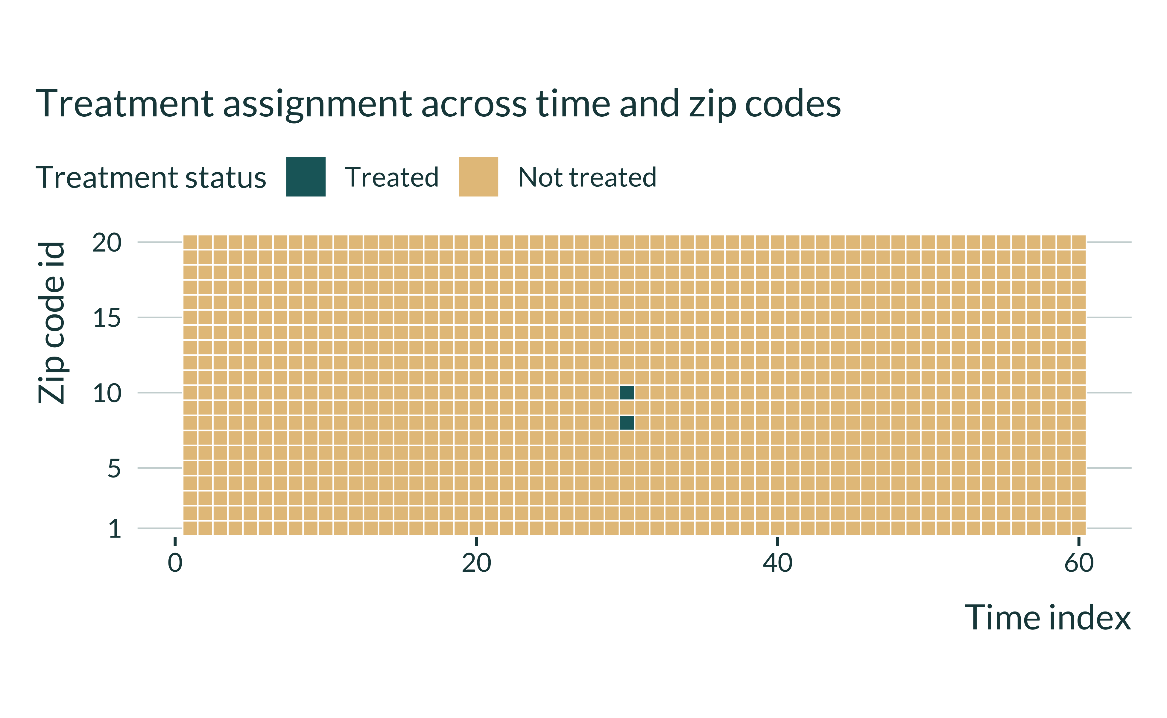
Under this set of parameters, a very limited number of observations are treated.
Quick data exploration
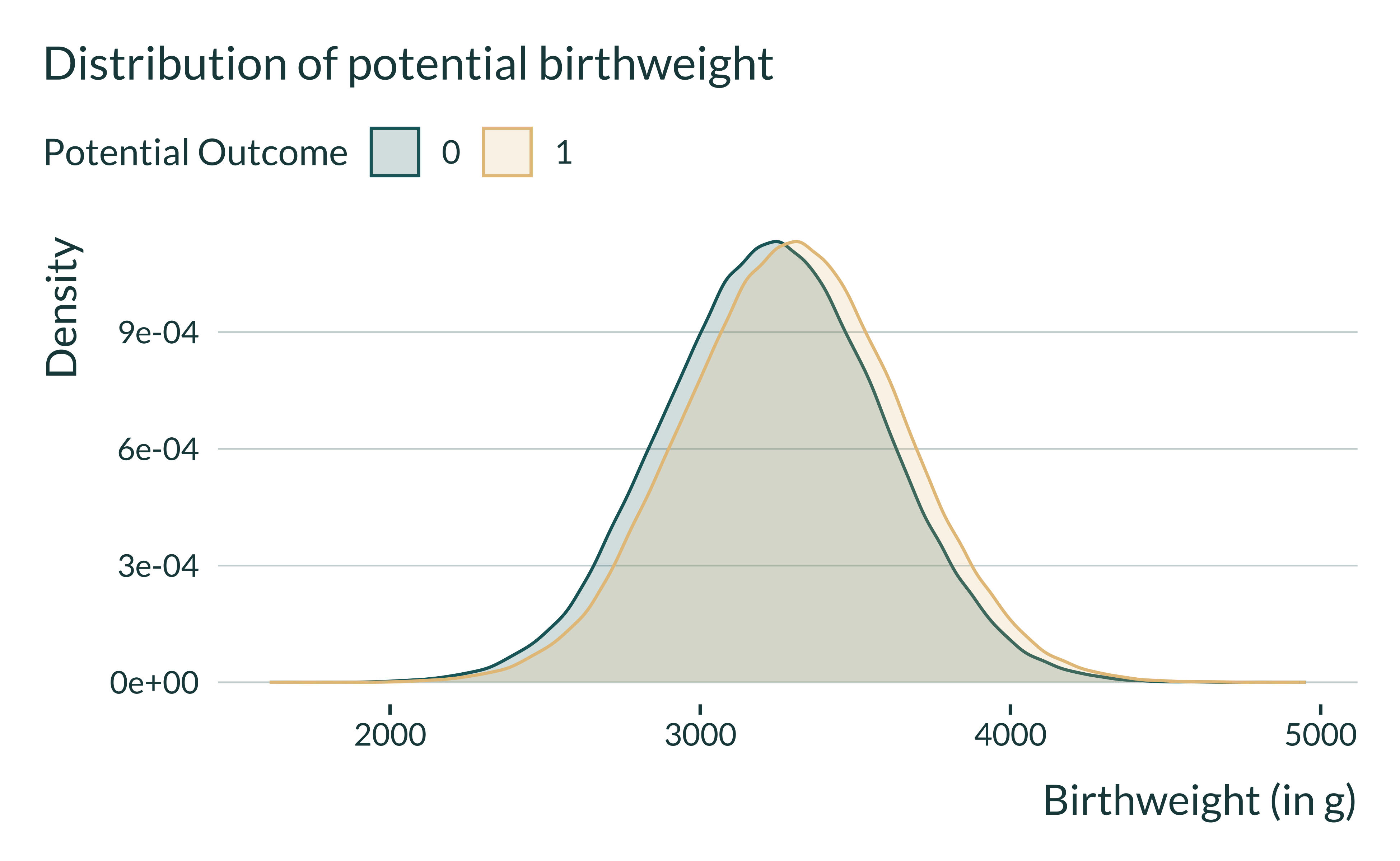
I quickly explore a generated data set to get a sense of how the data is distributed. First, I display the distribution of potential outcomes.
Show code
ex_data_shocks |>
  pivot_longer(
    cols = c(birthweight0, birthweight1),
    names_to = "potential_outcome",
    values_to = "potential_birthweight"
  ) |>
  mutate(potential_outcome = factor(str_remove(potential_outcome, "birthweight"))) |>
  ggplot(aes(x = potential_birthweight, fill = potential_outcome, color = potential_outcome)) +
  geom_density() +
  labs(
    x = "Birthweight (in g)",
    y = "Density",
    color = "Potential Outcome",
    fill = "Potential Outcome",
    title = "Distribution of potential birthweight"
  )
Estimation
I then define a function to run the estimation.
I cluster the standard error by zip code and time period. Lavaine and Neidell (2017) cluster standard error at the month and department level and Currie et al. (2015) at the plant-year level. They therefore both cluster at the period and group of units level, a higher level than mine.
Here is an example of an output of this function:
| term | estimate | se | p_value |
|---|---|---|---|
| treatedTRUE | 35.44544 | 4.82837 | 0 |
To double check the \(R^2\), I also display the output of a regression:
Show code
reg_ex <- baseline_param_shocks |>
  pmap_dfr(generate_data_shocks) |>
  feols(fml = birthweight ~ treated | zip + t, vcov = "twoway")

modelsummary::modelsummary(
  list("Birthweight" = reg_ex),
  gof_omit = "IC|Within|F|RMSE|Log"
)| Birthweight | |
|---|---|
| treatedTRUE | 27.634 |
| (3.834) | |
| Num.Obs. | 100000 |
| R2 | 0.098 |
| R2 Adj. | 0.079 |
| Std.Errors | by: zip & t |
One simulation
I now run a simulation, combining generate_data_shocks and estimate_shocks. To do so I create the function compute_sim_shocks. This simple function takes as input the various parameters. It returns a table with the estimate of the treatment, its p-value and standard error, the true effect and the proportion of treated units. Note that for now, I do not store the values of the other parameters for simplicity because I consider them fixed over the study.
Here is an example of an output of this function.
| term | estimate | se | p_value | N_z | N_t | p_treat | true_effect | n_treated |
|---|---|---|---|---|---|---|---|---|
| treatedTRUE | 33.65475 | 4.155194 | 0 | 2000 | 50 | 0.1 | 30 | 10000 |
All simulations
I will run the simulations for different sets of parameters by looping the compute_sim_shocks function over the set of parameters. I thus create a table with all the values of the parameters to test, param_shocks. Note that in this table each set of parameters appears N_iter times as we want to run the analysis \(n_{iter}\) times for each set of parameters.
I then run the simulations by looping our compute_sim_shocks function on param_shocks using the purrr package (pmap_dfr function).
Analysis of the results
Quick exploration
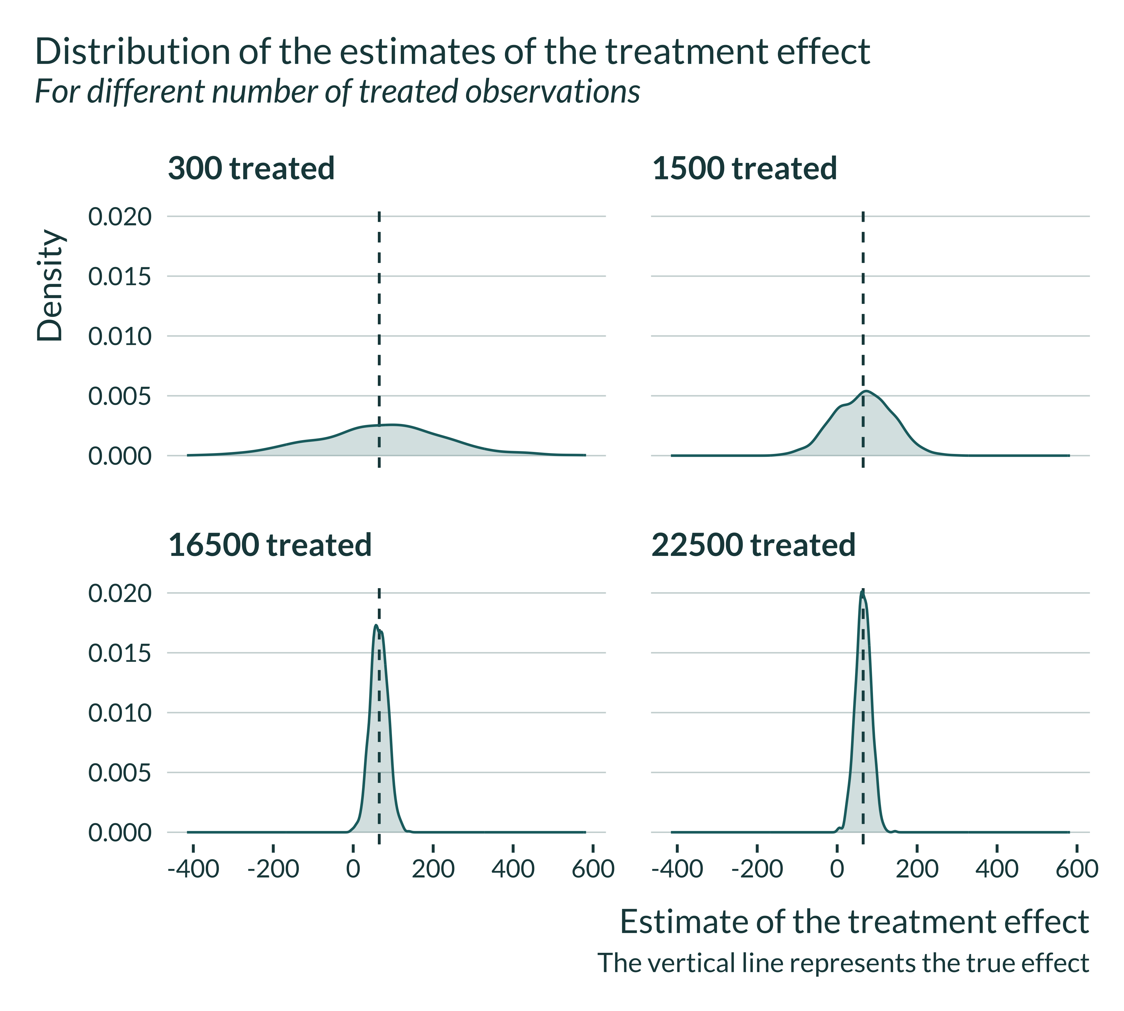
First, I quickly explore the results. I plot the distribution of the estimated effect sizes, along with the true effect. The estimator is unbiased and recover, on average, the true effect:
Show code
sim_shocks <- readRDS(here("Outputs/sim_shocks.RDS"))

sim_shocks |>
  filter(p_treat %in% sample(vect_p_treat, 4)) |>
  mutate(
    n_treat_name = fct_inseq(paste(n_treated)),
    N_z = paste("Number zip codes: ", str_pad(N_z, 2)),
    N_t = paste("Number periods: ", str_pad(N_t, 2))
  ) |>
  ggplot(aes(x = estimate)) +
  geom_vline(xintercept = unique(sim_shocks$true_effect)) +
  geom_density() +
  facet_wrap(~ fct_relabel(n_treat_name, \(x) paste(x, "treated")), nrow = 2) +
  labs(
    title = "Distribution of the estimates of the treatment effect",
    subtitle = "For different number of treated observations",
    x = "Estimate of the treatment effect",
    y = "Density",
    caption = "The vertical line represents the true effect"
  )
Computing bias and exaaggeration ratio
We want to compare \(\mathbb{E}\left[ \left| \frac{\widehat{\beta_{red}}}{\beta_1}\right|\right]\) and \(\mathbb{E}\left[ \left| \frac{\widehat{\beta_{red}}}{\beta_1} \right| | \text{signif} \right]\). The first term represents the bias and the second term represents the exaggeration ratio. These terms depend on the true effect size.
Main graph
To analyze our results, I build a unique and simple graph:
Show code
summary_sim_shocks |>
  ggplot(aes(x = n_treated, y = type_m)) +
  geom_line(linewidth = 1.2, color = "#E5C38A") +
  labs(
    x = "Number of treated observations",
    y = expression(paste("Average  ", frac("|Estimate|", "|True Effect|"))),
    title = "Evolution of bias with the number of treated observations",
    subtitle = "For statistically significant estimates",
    caption = paste("Fixed sample size:",
                    unique(summary_sim_shocks$N_z)*unique(summary_sim_shocks$N_t),
                    "observations \n")
) 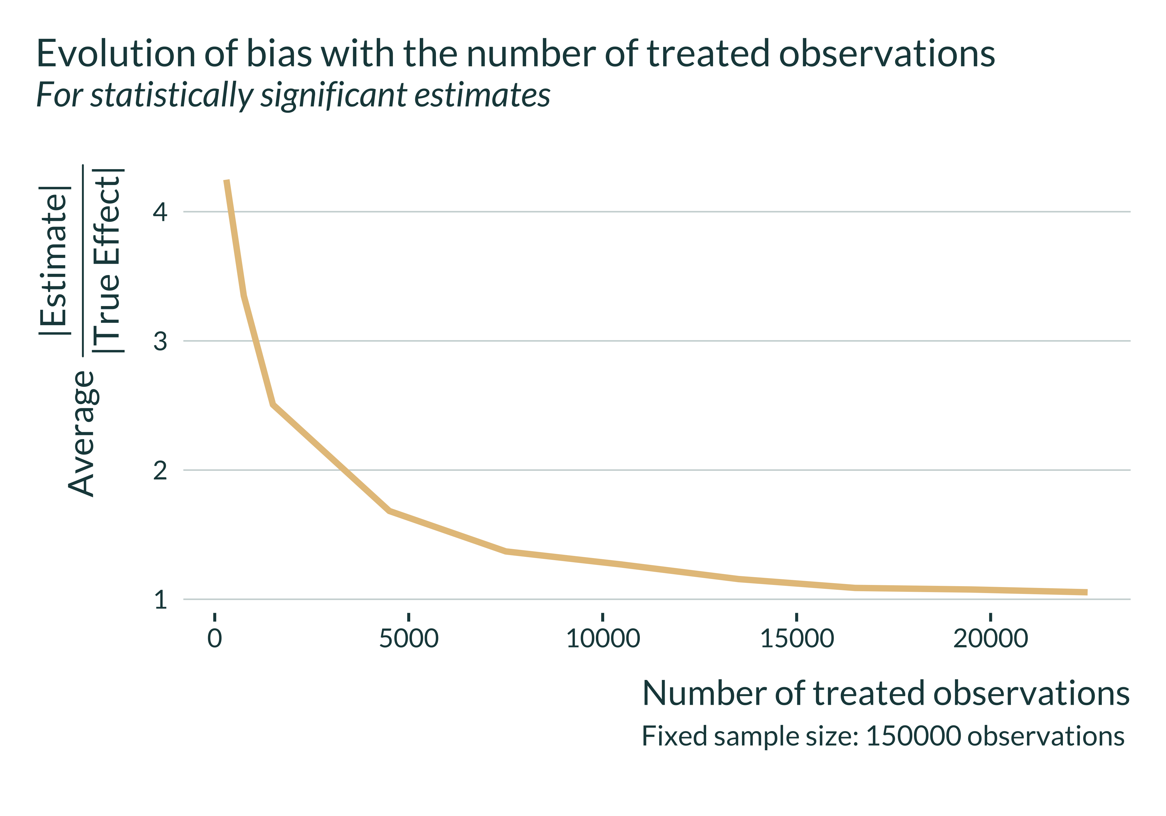
Magnitude of exaggeration
Let’s then have a quick look at the actual exaggeration and power numbers:
Show code
| Number of treated observations | Power | Exaggeration | Median SNR |
|---|---|---|---|
| 50 | 6.7 | 4.523 | 0.749 |
| 100 | 10.6 | 3.522 | 0.844 |
| 239 | 17.6 | 2.395 | 1.155 |
| 500 | 34.6 | 1.704 | 1.584 |
| 1000 | 57.9 | 1.328 | 2.199 |
| 2000 | 85.7 | 1.089 | 3.094 |
Here, the confounding-exaggeration trade-off is driven by the number of treated observations. Let’s explore the exaggeration of our simulation a sample size consistent with that of the literature. In Lavaine and Neidell (2017) there are about 240 treated observations. In my simulations, such a number of treated observations is associated with a rather large exaggeration: about 2.4.
Representativeness of the estimation
I calibrated my simulations to emulate a typical study from this literature. To further check that the results are realistic, I compare the average Signal-to-Noise Ratio (SNR) of the regressions from the simulations to the range of \(t\)-stat of existing studies investigating similar questions. Lavaine and Neidell (2017) find t-stats in the range 0.4 to 2.3 in their table 3 and 4. Currie et al. (2015) find t-stats in the range 0.5 to 4 (both in table 6 but t-stats in this range in table 4 and 5 as well).
As shown in the previous table, I find SNRs in a similar range or even larger and corresponding to substantial exaggeration ratios.