Intuition
As discussed in the introduction of the paper and the math section, controlling for confounders can cause a confounding / exaggeration trade-off mediated by the proportion of the variation absorbed by the controls. Adjusting for a variable (\(w\)) or adding fixed effects is equivalent to partialling out this variable or fixed effects from both \(x\) and \(y\). Since the variance of the estimator is given by the ratio of the variance of the residuals \(\sigma_{y^{\perp x, w}}^2\) over \(n\) times the variance of the explanatory variable after partialling out \(w\) (\(\sigma_{x^{\perp w}}^2\)), if controlling absorbs more of the variance in \(x\) than in \(y\), it will increase the variance of the resulting estimator and create exaggeration.
Simulation Framework
Illustrative example
To illustrate this causal exaggeration and show that it can arise in realistic settings, let’s consider an example setting: the impact of high temperatures on worker productivity. This setting might be particularly relevant as time and location fixed-effects are likely more correlated with temperature than with residual productivity. In addition, since this type of analysis focuses on effects in the tail of the temperature distribution, we may expect statistical power to be low: only a small subset of the observations contribute to the estimation of the treatment effect.
Lai et al. (2023) reviews this literature. Somanathan et al. (2021) and LoPalo (2023) have explored this question in the context of manufacturing in India and production of data for Demographic and Health Surveys (DHS) in a large range of countries respectively. Other examples of studies that leverage micro-data at the worker level study the impacts of high temperature on blueberry picking in California Stevens (2017), factory worker productivity in China (Cai, Lu, and Wang 2018), archers in China Qiu and Zhao (2022) or errors made by tennis players (Burke et al. 2023). Other studies also leverage micro-data to study the impact of temperature on productivity but at the firm-level (2012)
In the present analysis, I build my simulations to emulate a canonical study from this literature, measuring the impact of high temperature on worker productivity. A typical approach consists in estimating the link between different temperature bins and productivity, focusing in particular on high temperature bins. Usual approaches to explore this question typically rely on High Dimensional Fixed Effects models, including time and location fixed-effects to adjust for invariant characteristics such as seasonal demand (in Somanathan et al. (2021) and Cai, Lu, and Wang (2018) for instance) or location differences. As underlined by LoPalo (2023), fixed effects limit the variation used for identification: location “fixed effects restrict the variation used in the analysis to variation within a survey wave [i.e., a time ”period”]”.
Modeling choices
Overview of the DGP
To simplify and since negative effects of temperature on production are only found for high temperatures, in the DGP, I assume that only high temperatures affect productivity (the effect of low temperatures therefore does not need to be modeled). For simplicity, I only consider time fixed-effects and abstract from location ones. This is equivalent to assuming that all the individuals in the analysis work in locations that experience the same contemporaneous weather, e.g., are close to one another. Regardless, location fixed effect would be absorbed by the individual fixed-effects in include in the analysis.
The DGP can be represented using the following Directed Acyclic Graph (DAG), where \(InBin\) represents high temperatures within a given temperature bin of interest, such that \(InBin = \mathbb{1}\{Temp \in (T_L,T_H ] \}\) where \((T_L,T_H ]\) is the temperature bin of interest.
Show code
second_color <- str_sub(colors_mediocre[["four_colors"]], 10, 16)

dagify(Prod ~ InBin + Period + u + Indiv,
       Temp ~ Period + e,
       InBin ~ Temp,
       exposure = c("Prod", "Temp", "InBin", "Period", "Indiv"),
       # outcome = "w",
       latent = c("u", "e"),
       coords = list(
         x = c(Prod = 3, Temp = 2, InBin = 2.5, Period = 2.5, e = 1.5, u = 3, Indiv = 3),
         y = c(Prod = 1, Temp = 1, InBin = 1, Period = 0, e = 1, u = 1.5, Indiv = 0))
  ) |>
  ggdag_status(text_size = 3.5) +
  theme_dag_blank(legend.position = "none") +
  scale_mediocre_d(pal = "coty") +
  annotate(#parameters
    "text",
    x = c(2.75, 2.8, 2.2),
    y = c(1.1, 0.45, 0.45),
    label = c("beta", "delta", "gamma"),
    parse = TRUE,
    color = "black",
    size = 5
) 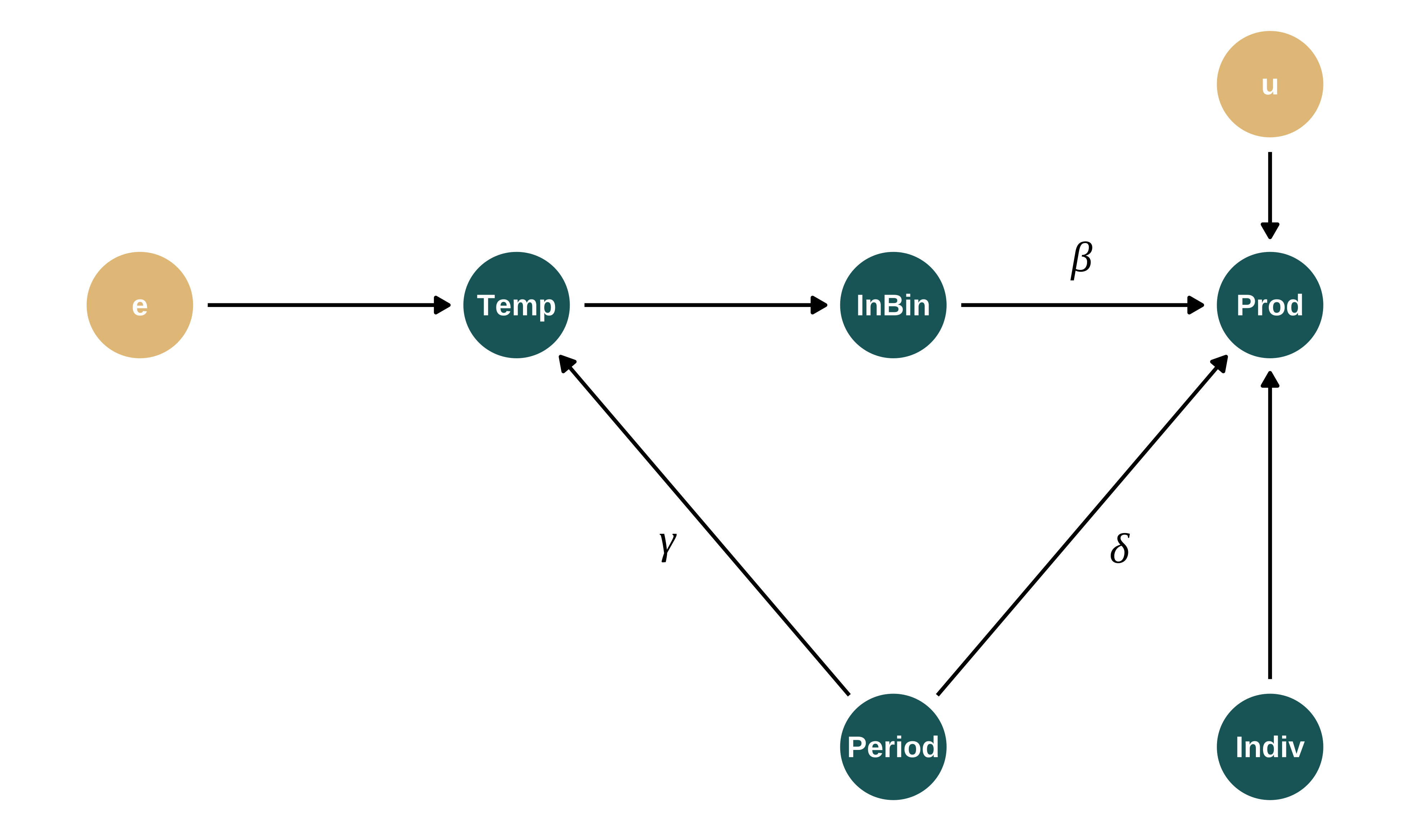
Individual production (\(Prod\)) and temperature (\(Temp\)) depend on period fixed effects (\(Period\)), individual fixed effects (\(Indiv\)) and non-modeled components (\(u\) and \(e\)). Note that this DAG encompasses a set of further modeling choices, in particular regarding the absence of causal relationships between some variables.
Discussion of modeling choices
Other variables than individual or period fixed effects and high temperatures may affect productivity (precipitation for instance). I do not model them to simplify the data generating process. While this may limit the representativity of my simulations, it does not affect its results since the models I consider accurately represent the data generating process. Including additional controls may however increase the precision of the resulting estimator. To address such concerns, I include individual fixed effects which intensity I can vary to adjust the non-explained variation in productivity. In addition, at the end of this document, I compare the Signal-to-Noise Ratios in my simulations to those in existing studies to confirm that my simulations are in line with existing studies in terms of precision.
I do not generate correlation between periods. While this may seem restrictive, it is a conservative assumption as it eases the recovery of the effect of interest by simplifying the actual DGP.
Finally, I assume that the effect of temperature on productivity is non-null in only one of the bins, as it is often the case in existing studies.
DGP equations
I assume that the temperature at time \(t\) in period \(\tau\) is defined as follows:
\[Temp_{t\tau} = \mu_{Temp} + \gamma\lambda_{\tau} + \epsilon_{t}\]
where \(\mu_{Temp}\) is an intercept representing the average temperature. \(\lambda_{\tau}\) are period fixed-effects with mean 0 and variance 1, such that their variance can be modified via \(\gamma\). This particular structure of fixed effects allows to control for the intensity of the fixed effects via a parameter. It assumes that the data generating process for temperature is as follows:
- Observations are drawn for all the time indexes (e.g. days) from a distribution shared across period (e.g. months): \(\epsilon\)
- These distributions are “shifted” period-by-period by adding period fixed-effects—drawn from a distribution with mean 0, leaving the average of temperature unchanged: \(\gamma\lambda_{\tau}\).
This is equivalent to assuming that the variance of temperature can be decomposed into a between-months component and a within-month one. This is quite representative of the distribution of existing temperatures, as discussed below. The same structure is retained for productivity.
\(Prod_{it\tau}\), the production of worker \(i\) at time \(t\) in period \(\tau\) is defined as:
\[Prod_{it\tau} = \beta_0 + \eta_i + \delta\lambda_{\tau} + \beta_1 \cdot \mathbb{1}\{Temp_{t\tau} \in (T_L,T_H ] \} + u_{it}\] where \(\eta_i\) are individual fixed-effects. \(\lambda_{\tau}\) are period (month) fixed-effects.
DGP and varying parmeters
The goal of these simulations is to vary the proportion of the variation in temperature and production the period fixed-effect explain (i.e., to vary \(\gamma\) and \(\delta\) to modify the month-to-month variation in temperature and production). However, to make results across parameter sets comparable and these variations ceteris paribus, it is crucial that varying \(\gamma\) and \(\delta\) does not affect the variance of the temperature within the bin of interest and production (our \(x\) and \(y\) in the regression). I therefore fix the variance of temperature and productivity by defining the non-modeled variance, i.e., the variance of the residuals, as a function of \(\gamma\) and \(\delta\). Since the variance of interest for \(x\) is actually the variance within a bin and not temperature itself, I consider bins of interest that are closed. That way, the variance remains relatively stable when \(\gamma\) and \(\delta\) vary (it is very roughly equal to the variance of a uniform distribution defined over the width of the bin).
As discussed in the maths section of the paper, the omitted variable bias is also a function of \(\delta\) and \(\gamma\): \(OVB = \dfrac{\delta \gamma \sigma_{\lambda}^{2}}{\sigma_{InBin}^{2}}\). Thus, to keep the OVB constant when \(\gamma\) varies, I set \(\kappa = \delta\gamma\) to be fixed.
Details on parameters and variables
More precisely, I set:
- \(N_i\) the number of workers
- \(N_t\) the number of time steps (e.g., days)
- \(l_\tau\) the length of a period (e.g., 30 days)
- \(FE_{\tau} = \lambda_{\tau} \sim \mathcal{U}(-\sqrt{3}, \sqrt{3})\) such that it as mean 0 and variance 1 and the period fixed effects for production and temperature have mean 0 and variance \(\delta^2\) and \(\gamma^2\) respectively,
- \(Temp_{t\tau} = \mu_{Temp} + \gamma\lambda_{\tau} + \epsilon_{t}\)
- \(\epsilon_{rt} \sim \mathcal{N}(0, \sigma_{\epsilon}^{2})\) the within-period component of \(Temp_{t\tau}\). For the variance of temperature to remain constant when \(\gamma\) varies, I set \(\sigma_{\epsilon}^2 = \sigma_{Temp}^2 - \gamma^2\). This bounds \(\gamma\) to be smaller than \(\sigma_{Temp}\)
- Bins: I do not parametrize the bins and set them as fixed, only parametrizing the bin of interest. In define bins of with 2 degree Celsius (or about 5 Fahrenheit) as most papers in this literature. I define the bin of interest by setting \(T_L\) such that the bin of interest is \((T_L,T_L + 2]\).
- \(FE_i = \eta_i \sim \mathcal{N}(0, \sigma_{\eta}^{2})\), individual fixed effects.
- \(u_{it} \sim \mathcal{N}(0, \sigma_{u}^{2})\)
- \(Prod_{it\tau} = \beta_0 + \eta_i + \delta\lambda_{\tau} + \beta_1 \mathbb{1}\{Temp_{t\tau} \in (T_L,T_H ] \} + u_{it}\). For the variance of productivity to remain constant when \(\gamma\) varies, I set \(\sigma_u^2 = \sigma_{P}^2 - \sigma_{\eta}^2 - \delta^2 - \beta_1^2\sigma_{InBin}^2 - 2\delta\beta_1\text{cov}(InBin_{t\tau}, \lambda_{\tau})\). There is a complex correlation structure between \(InBin\) and \(\lambda_{\tau}\). I simplify this by assuming that \(\text{cov}(InBin_{t\tau}, \lambda_{\tau}) \propto \text{cov}(Temp_{t\tau}, \lambda_{\tau}) = \gamma\) and therefore, the last term reduces to \(2\beta_1\delta\gamma = 2\beta_1\kappa C\). Since \(\kappa = \gamma\delta\) is fixed, this term does not vary with \(\gamma\) and is therefore only a scaling parameter that one can adjust by modifying the value given of \(\sigma_P^2\). I thus set C to 1 and adjust \(\sigma_P^2\) to get a distribution of production as desired. I double check post-hoc, that the hypothesis regarding the covariance holds (that \(\sigma_P^2\) does not vary with \(\gamma\)). Also note that this expression for \(\sigma_u^2\) bounds \(\delta\).
Data generation
Generating function
I write a simple function that generates the data. It takes as input the values of the different parameters and returns a data frame containing all the variables for this analysis.
generate_data_fe <- function(N_i,
                             N_t,
                             length_period_fe,
                             mu_temp,
                             sigma_temp,
                             mu_prod,
                             sigma_prod,
                             sigma_indiv_fe,
                             bin_interest_low,
                             bin_ref_low,
                             beta_1,
                             gamma,
                             kappa) {

  delta <- kappa/gamma

  data <-
    tibble(t = 1:N_t) |>
    mutate(period = t %/% length_period_fe + 1) |>
    group_by(period) |>
    mutate(period_fe = runif(1, -sqrt(3), sqrt(3))) |>
    # mutate(period_fe = 3*(rbeta(1, 0.5, 0.5) - 1/2)) |>
    ungroup() |>
    mutate(
      sigma_epsilon = sqrt(sigma_temp^2 - gamma^2),
      epsilon = rnorm(N_t, 0, sigma_epsilon),
      temp = mu_temp + gamma*period_fe + epsilon,
      bin_temp = cut(temp, breaks = c(-50, seq(11, 35, 2), 100)),
      bin_temp = fct_relevel(bin_temp,
                             str_c("(", bin_ref_low, ",", bin_ref_low + 2,"]"),
                             after = 0),
      bin_interest = str_c("(", bin_interest_low, ",", bin_interest_low + 2,"]")
    ) |>
    crossing(indiv = 1:N_i) |>
    group_by(indiv) |>
    mutate(indiv_fe = rnorm(1, 0, sigma_indiv_fe)) |>
    ungroup() |>
    mutate(
      sigma_u = sqrt(
        sigma_prod^2
        - sigma_indiv_fe^2
        - delta^2
        - beta_1^2*0.3 #roughly var of a uniform distribution of width 2
        - 2*kappa*beta_1
      ),
      u = rnorm(N_i*N_t, 0, sigma_u),
      prod = mu_prod + beta_1*(bin_temp == bin_interest) +
        indiv_fe + delta*period_fe + u
    ) |>
    select(indiv, t, period, everything(), -starts_with("sigma"))

  return(data)
}
Calibration and baseline parameters’ values
I set baseline values for the parameters to emulate a realistic observational study in this field. These values are coherent with several analyses from the literature. However, not all analyses in this literature suffer from the issue discussed here but some likely do. I focus on such settings. I thus calibrate the parameters as follows:
Number of observations: Burke et al. (2023) summarizes the number of observations in recent papers from this literature (table S1): it ranges from 202 to 19 millions, with a median of 140,000. Somanathan et al. (2021) is one of the most thorough papers in this literature. My simulation is closed to their “Temperature Effects on Worker Output” section in which the various specifications have between 9 and 147 units and between 365 and 3337 time steps for a number of observations ranging between 7300 and 54020. I select a number of observations in line with a typical analysis in this paper and literature, setting
N_i = 70andN_t = 700, for a total of 49000 observations.Distribution of the production: I consider that production is normally distributed. Stevens (2017) reports the distribution of the average productivity by worker (blueberry pickers) in Figure 3. While the distribution is not perfectly normal, it seems to be a relatively reasonable assumption. Production is a function of the way units are defined; any mean may be realistic. The value of interest is the ratio mean/standard deviation. In LoPalo (2023), this ratio is roughly equal to 0.9. In Stevens (2017), it ranges between 0.4 and 0.6 (Table 1). To avoid negative values considering the normality assumption, I choose an intermediary value and set
mu_prod = 100andsigma_prod = 0.5*mu_prod.Individual fixed effects: LoPalo (2023) reports the individual FEs observed in their setting in figure 7 panel A. The distribution is not exactly normal but it might be an acceptable approximation. In their setting, individual fixed effects account for about half of the standard deviation of the outcome. I thus set
sigma_indiv_fe = 0.5*sigma_prod. I set their mean to 0, assuming that it is encompassed in \(\beta_0\).Distribution of temperature: I set the mean and standard deviation of the wet bulb temperature to be equal to the values experienced in New York City. I set
mu_temp = 16.5andsigma_temp = 9.Results from the literature: Somanathan et al. (2021) documents a reduction in productivity between 2 and 8% when a day below 19°C is swapped with a day above 35°C dry bulb (and comparable results between 33 and 35). LoPalo (2023) finds that productivity decreases by 13.6% on a day with wet bulb temperature above 29.5°C as compared to a day between 10 and 15.5°C. Stevens (2017) documents a 12% reduction in productivity when a day in the (27, 29.5]°C bin is swapped with a day above 38°C. Cai, Lu, and Wang (2018) a 8.5% reduction in temperature above 35°C wet bulb as compared to a day between 24°C and 26.5°C. Hsiang (2010) finds effects above 25°C in wet bulb temperature.
- Bin of interest: To keep the variance of temperature within the bin constant when \(\gamma\) varies (to not affect the precision of the estimator through this mean), I consider a close bin. Since I model thew wet bulb temperature, I choose a bin of interest of (29, 31] such that
bin_interest_low = 29. - Reference bin: Based on the literature above, in particular Somanathan et al. (2021) and LoPalo (2023), I set a reference (or omitted) bin of (11, 13], such that
bin_ref_low = 11. - Treatment effect size: Since I chose a relatively low bin of interest (and not temperature above a high threshold), I do not pick a very large treatment effect, since the magnitude of the effect is more limited for lower temperature. I however still choose a treatment effect size in line with what is observed in the literature:
beta_1 = -0.03*mu_prod
- Bin of interest: To keep the variance of temperature within the bin constant when \(\gamma\) varies (to not affect the precision of the estimator through this mean), I consider a close bin. Since I model thew wet bulb temperature, I choose a bin of interest of (29, 31] such that
Temperature fixed effects: As noted previously,
gammacannot be larger thansigma_temp. I will thus vary it between 4 and 8.9.Omitted variable bias: I consider a very large OVB, twice the magnitude of the treatment effect (OVB = 2). The OVB is given by \(\dfrac{\kappa\sigma_{\lambda}^2}{\sigma_{InBin}^2}\). Therefore, I set
kappa = -15. I also adjust it post-hoc since it only changes the bias of the estimator from the model with no fixed effects. The minus sign ensures that the OVB is upward biased and therefore goes in the same direction as exaggeration. This hypothesis clarifies the results but does not change the conclusions of the analysis.
| N_i | N_t | length_period_fe | mu_temp | sigma_temp | mu_prod | sigma_prod | bin_interest_low | bin_ref_low | sigma_indiv_fe | beta_1 | gamma | kappa |
|---|---|---|---|---|---|---|---|---|---|---|---|---|
| 70 | 700 | 30 | 17.5 | 9 | 100 | 50 | 29 | 11 | 25 | -4 | 7.4 | -15 |
Here is an example of data created with the data generating process and baseline parameter values, for 4 individuals and 2 period of 1 time steps each:
| indiv | t | period | period_fe | epsilon | temp | bin_temp | bin_interest | indiv_fe | u | prod |
|---|---|---|---|---|---|---|---|---|---|---|
| 1 | 1 | 2 | -1.49 | 8.08 | 14.54 | (13,15] | (29,31] | -23.00 | -26.25 | 53.77 |
| 2 | 1 | 2 | -1.49 | 8.08 | 14.54 | (13,15] | (29,31] | -49.94 | -4.45 | 48.63 |
| 3 | 1 | 2 | -1.49 | 8.08 | 14.54 | (13,15] | (29,31] | -6.81 | 17.89 | 114.10 |
| 4 | 1 | 2 | -1.49 | 8.08 | 14.54 | (13,15] | (29,31] | -7.88 | -32.50 | 62.64 |
| 1 | 2 | 3 | 1.10 | -4.90 | 20.75 | (19,21] | (29,31] | -23.00 | -54.07 | 20.70 |
| 2 | 2 | 3 | 1.10 | -4.90 | 20.75 | (19,21] | (29,31] | -49.94 | -32.58 | 15.25 |
| 3 | 2 | 3 | 1.10 | -4.90 | 20.75 | (19,21] | (29,31] | -6.81 | 0.50 | 91.46 |
| 4 | 2 | 3 | 1.10 | -4.90 | 20.75 | (19,21] | (29,31] | -7.88 | -6.37 | 83.52 |
Quick data exploration
I quickly explore a generated data set to get a sense of how the data is distributed and to make sure that the calibration has been done properly.
Show code
ex_data_fe <- baseline_param_fe |>
  pmap(generate_data_fe) |>
  list_rbind()

vars_of_interest <- c("prod", "temp", "indiv_fe", "period_fe", "u", "epsilon")

ex_data_fe |>
  pivot_longer(cols = vars_of_interest) |>
  ggplot(aes(x = value)) +
  geom_histogram(bins = 20) +
  # geom_density() +
  facet_wrap(~ name, scales = "free") +
  labs(
    title = "Distribution of the variables in the data set",
    x = "Variable value",
    y = "Density"
) 
Show code
#table
means <- ex_data_fe |>
  reframe(across(
    .cols = vars_of_interest,
    \(x) mean(x, na.rm = TRUE)
  )) |>
  mutate(metric = "Mean", .before = 1)

sds <- ex_data_fe |>
  reframe(across(
    .cols = vars_of_interest,
    \(x) sd(x, na.rm = TRUE)
  )) |>
  mutate(metric = "Sd", .before = 1)

bind_rows(means, sds) |>
kable()| metric | prod | temp | indiv_fe | period_fe | u | epsilon |
|---|---|---|---|---|---|---|
| Mean | 95.47995 | 18.360584 | -4.168381 | 0.1376458 | 0.1330608 | -0.1579947 |
| Sd | 49.32695 | 9.000084 | 25.927697 | 0.9876026 | 41.8476039 | 4.8571961 |
This looks like the desired distributions as well as do the means and standard deviations. Note that the mean of the individual fixed effects is not perfectly 0 but they are negligible as compared to the means of the other variables and as compared to their standard deviations.
I then check that the distribution of temperature and its yearly variations are sensible and that they are consistent with distributions observed in actual settings.
First, I explore the distribution of temperature month by month for a simulated data set, for the two extreme values of gamma considered. I define month by grouping periods into 12 groups, based on the value of their fixed effects.
Show code
graph_ridge_sim <- function(gamma_plot) {
  baseline_param_fe |>
    mutate(gamma = gamma_plot, N_i = 1, N_t = 10000)  |>
    pmap(generate_data_fe) |>
    list_rbind() |>
    mutate(gamma = gamma_plot) |>
    group_by(period = as.factor(period)) |>
    mutate(mean_temp = mean(temp)) |>
    ungroup() |>
    arrange(mean_temp) |>
    nest(nst = -period) |>
    mutate(month = cut_number(row_number(), n = 12, labels = FALSE)) |>
    unnest(nst) |>
    # arrange(mean_temp) |>
    ggplot(aes(x = temp, y = as_factor(month))) +
    ggridges::geom_density_ridges(
      fill = colors_mediocre[["base"]],
      color = colors_mediocre[["base"]],
      alpha = 0.5
    ) +
    xlim(c(-20, 50)) +
    labs(
      title = "Distribution of Generated Temperatures by Month",
      subtitle = paste(
        "For gamma =", gamma_plot, ", ie",
        round(gamma_plot^2/baseline_param_fe$sigma_temp^2, 3)*100, "%",
        "of variance from month-to-month variation"),
      x = "Temperature (°C)",
      y = "Month Index"
    )
}

graph_ridge_sim(8.6) 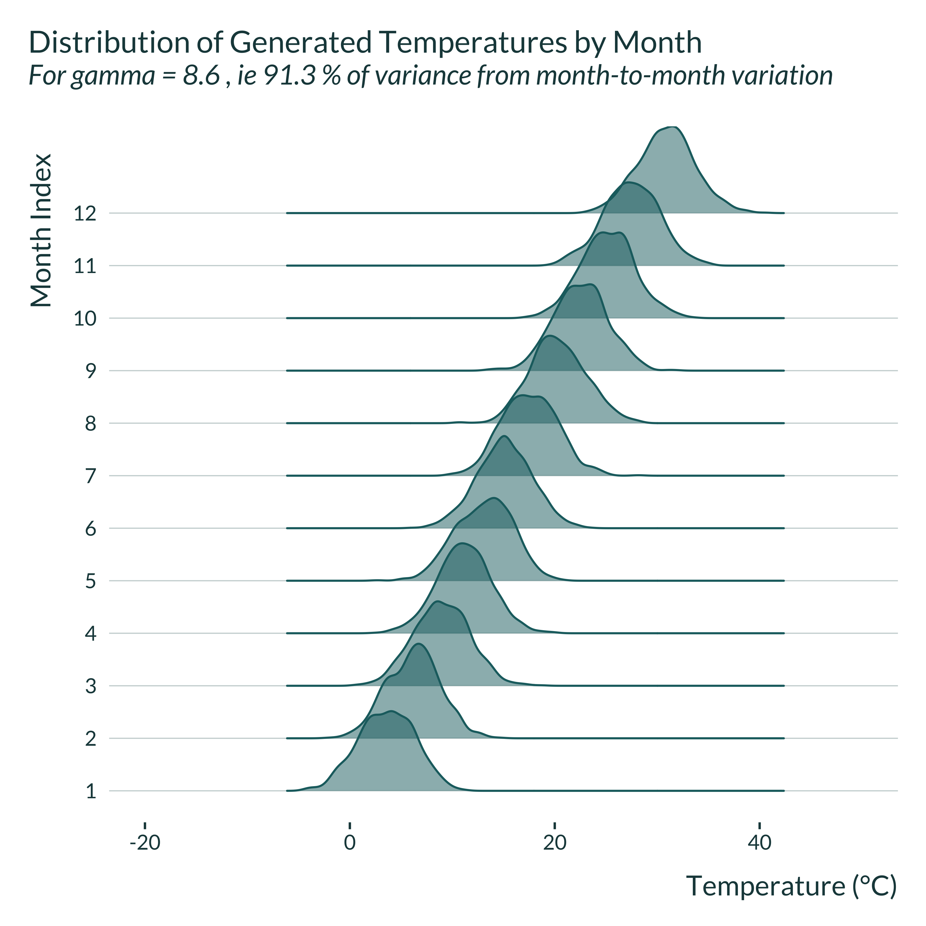
Show code
graph_ridge_sim(4)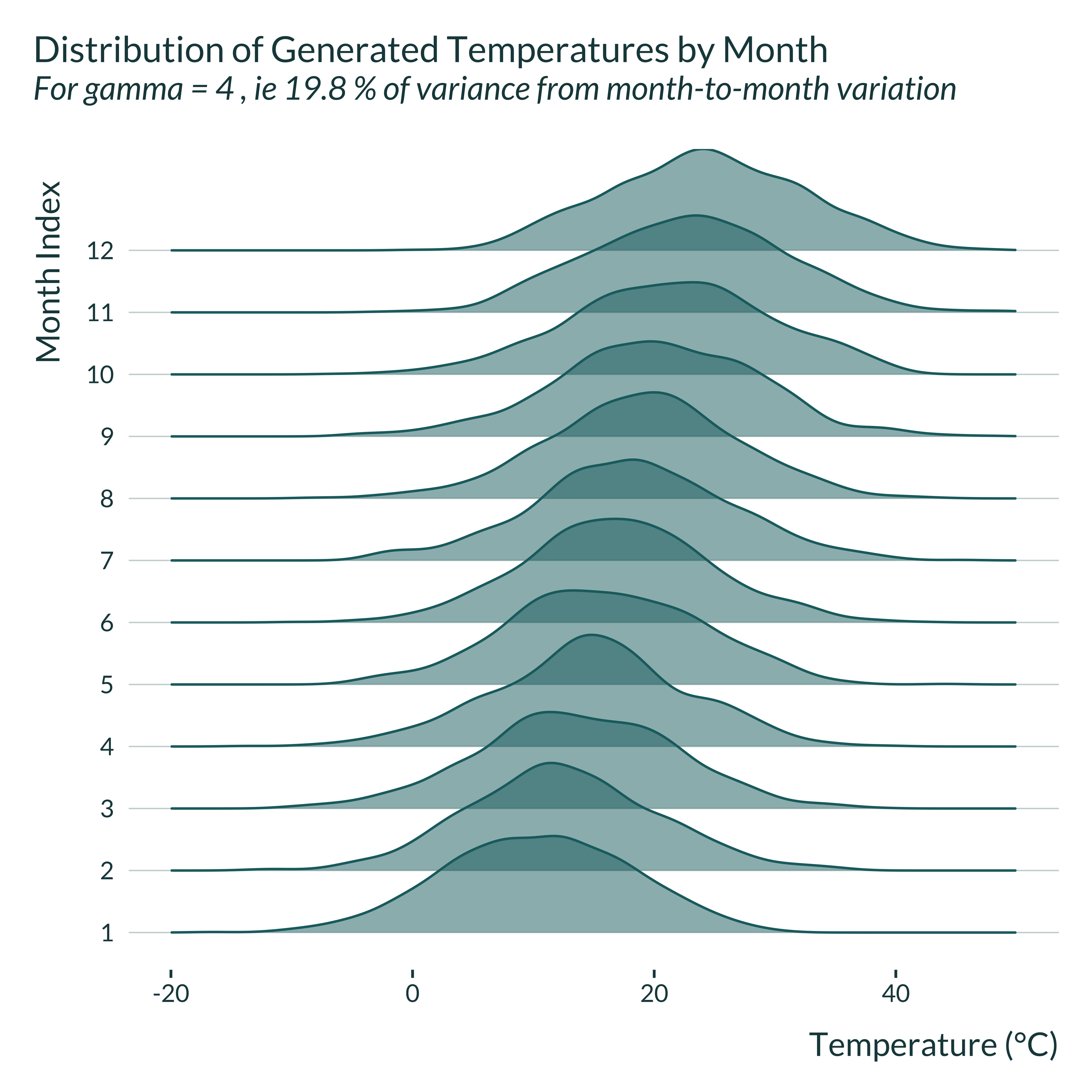
Then, I compare these generated distribution to some observed in actual settings. To do so, I retrieve wet bulb temperature data in the US from Spangler, Liang, and Wellenius (2022). I wrangle it and focus on San Diego and New York counties. I picked these counties because they respectively exhibit large and small variations in month-to-month temperature. Many other counties exhibit similar patterns.
Show code to wrangle the data
fips_interest <- tibble(
  county_name = c("New York", "San Diego"),
  fips = c("36061", "06073")
)

temp_data <- readRDS(here("inputs", "FE_temperature", "temp_data.Rds")) |>
  as_tibble() |>
  janitor::clean_names() |>
  # filter(year > 2015) |>
  select(fips = st_co_fips, date, tmax_c, wbg_tmax_c) |>
  mutate(
    month = month(date),
    year = year(date)
  ) |>
  group_by(month, fips) |>
  mutate(mean_wbg = mean(wbg_tmax_c, na.rm = TRUE)) |>
  ungroup()

small_temp_data <- temp_data |>
  right_join(fips_interest, by = join_by(fips))

saveRDS(small_temp_data, here("Outputs", "small_temp_data.RDS"))
Show code to make the graphs
small_temp_data <- readRDS(here("Outputs", "small_temp_data.RDS"))

graph_ridge_actual <- function(data, county) {
  data |>
    filter(county_name == county) |>
    group_by(fips) |>
    mutate(
      month = month(month, label = TRUE) |>
        fct_reorder(mean_wbg)
    ) |>
    ungroup() |>
    ggplot(aes(x = tmax_c, y = month)) +
    ggridges::geom_density_ridges(
      fill = colors_mediocre[["base"]],
      color = colors_mediocre[["base"]],
      alpha = 0.5
    ) +
    xlim(c(-20, 40)) +
    labs(
      title = "Distribution of Observed Temperatures by Month",
      subtitle = paste("In the", county, "county"),
      x = "Temperature (°C)",
      y = "Month"
    )
}

small_temp_data |>
  graph_ridge_actual("New York")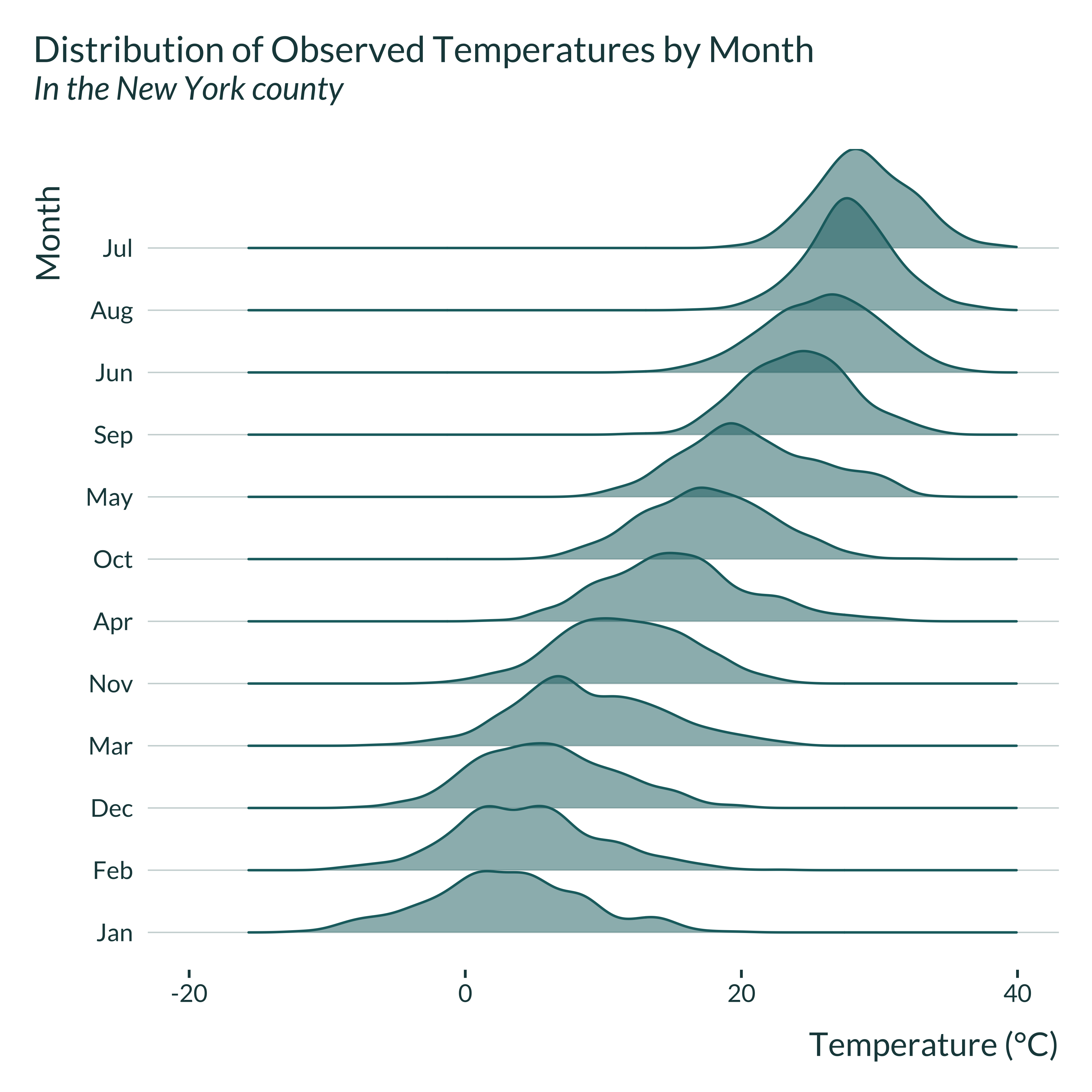
Show code to make the graphs
    small_temp_data |>
  graph_ridge_actual("San Diego")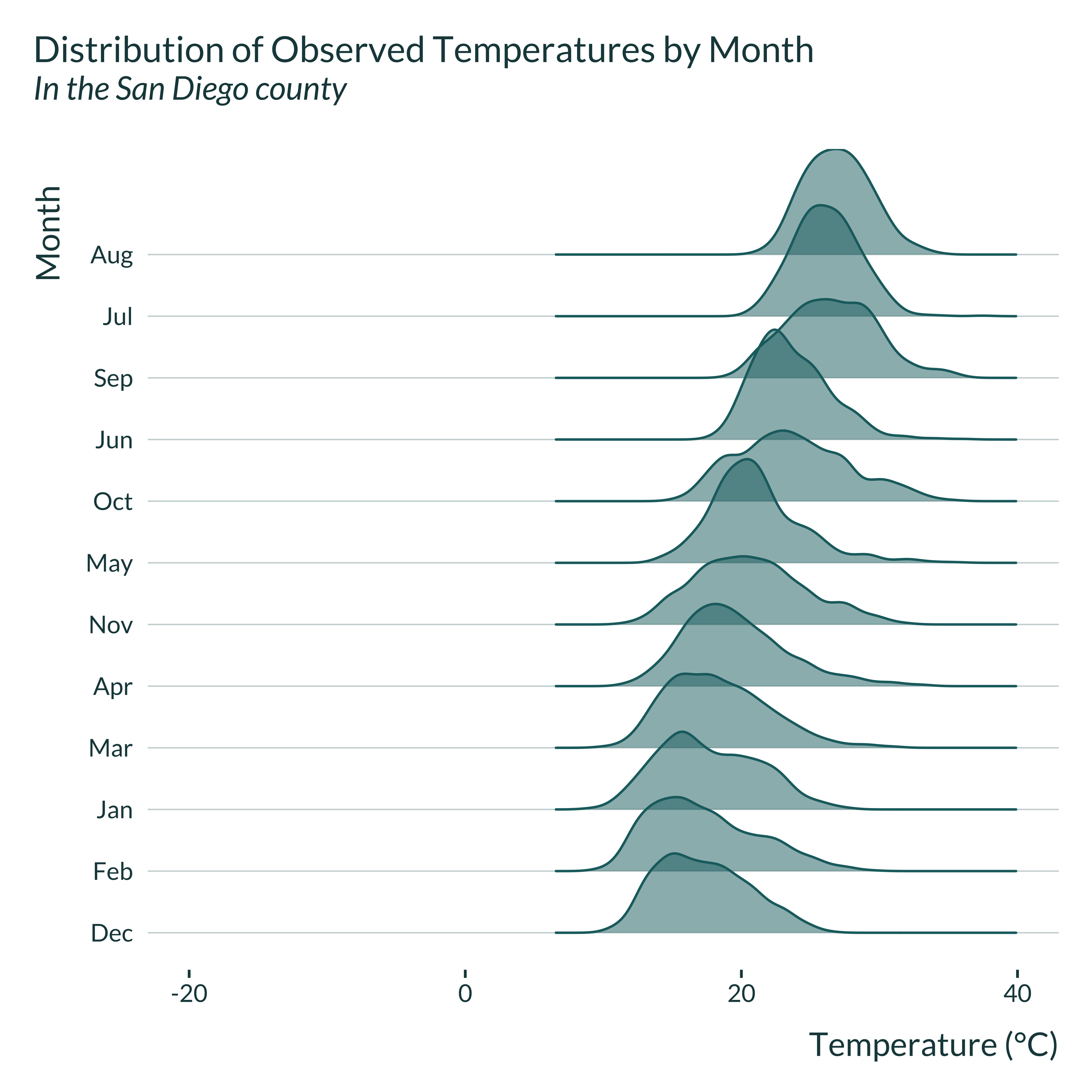
The simulated distributions are not perfectly similar to the observed ones but display comparable features: the month-to-month variation in temperature in New York county is important while it is limited in San Diego county. While the simulations are not perfectly realistic, they reproduce patterns observed in actual settings, even just within the US1.
Estimation
I then define a function to run the estimations (with and without fixed effects). I cluster standard errors at the individual level, following Somanathan et al. (2021).
estimate_fe <- function(data) {
  reg_fe <-
    feols(
      data = data,
      fml = prod ~ bin_temp | period + indiv,
      cluster = ~ indiv
    ) |>
    broom::tidy()  |>
    mutate(model = "fe")

  reg_no_fe <-
    feols(
      data = data,
      fml = prod ~ bin_temp | indiv,
      cluster = ~ indiv
    ) |>
    broom::tidy() |>
    mutate(model = "no_fe")

  bind_rows(reg_fe, reg_no_fe) |>
    filter(term == str_c("bin_temp", unique(data$bin_interest))) |>
    rename(p_value = p.value, se = std.error) |>
    mutate(#to check that the variance of x and y do not vary with gamma
      var_u = var(data$u, na.rm = TRUE),
      var_temp = var(data$temp, na.rm = TRUE),
      var_prod = var(data$prod, na.rm = TRUE)
    )
}
Here is an example of an output of this function:
| term | estimate | se | statistic | p_value | model | var_u | var_temp | var_prod |
|---|---|---|---|---|---|---|---|---|
| bin_temp(29,31] | -2.331272 | 1.437131 | -1.622172 | 0.1093274 | fe | 1767.41 | 72.62306 | 2519.402 |
| bin_temp(29,31] | -5.773004 | 1.251857 | -4.611552 | 0.0000178 | no_fe | 1767.41 | 72.62306 | 2519.402 |
One simulation
We can now run a simulation, combining generate_data_fe and estimate_fe. To do so I create the function compute_sim_fe.
Show code
compute_sim_fe <- function(...) {
  generate_data_fe(...) |>
    estimate_fe() |>
    suppressMessages() |>
    bind_cols(as_tibble(list(...))) #add parameters used for generation
}
Here is an example of an output of this function.
| term | estimate | se | statistic | p_value | model | var_u | var_temp | var_prod | N_i | N_t | length_period_fe | mu_temp | sigma_temp | mu_prod | sigma_prod | bin_interest_low | bin_ref_low | sigma_indiv_fe | beta_1 | gamma | kappa |
|---|---|---|---|---|---|---|---|---|---|---|---|---|---|---|---|---|---|---|---|---|---|
| bin_temp(29,31] | -3.528378 | 1.256971 | -2.807048 | 0.0064942 | fe | 1759.949 | 60.56018 | 2270.595 | 70 | 700 | 30 | 17.5 | 9 | 100 | 50 | 29 | 11 | 25 | -4 | 7.4 | -15 |
| bin_temp(29,31] | -5.787941 | 1.227412 | -4.715566 | 0.0000122 | no_fe | 1759.949 | 60.56018 | 2270.595 | 70 | 700 | 30 | 17.5 | 9 | 100 | 50 | 29 | 11 | 25 | -4 | 7.4 | -15 |
All simulations
I run the simulations for different sets of parameters by looping the compute_sim_fe function over the set of parameters. I thus create a table with all the values of the parameters to test, param_fe. Note that in this table each set of parameters appears n_iter times as we want to run the analysis \(n_{iter}\) times for each set of parameters.
I then run the simulations by looping our compute_sim_fe function on param_fe using the purrr package (pmap function).
future::plan(multisession, workers = availableCores() - 1)

sim_fe <- future_pmap(param_fe, compute_sim_fe, .progress = TRUE) |>
  list_rbind(names_to = "sim_id") |>
  as_tibble()

beepr::beep()

saveRDS(sim_fe, here("Outputs", "sim_fe.RDS"))
Analysis of the results
Quick exploration
First, I quickly explore the results. I plot the distribution of the estimated effect sizes.
Show code
sim_fe <- readRDS(here("Outputs", "sim_fe.RDS"))

sim_fe |>
  mutate(
    signif = p_value < 0.05,
    signif_name = ifelse(signif, "Significant", "Non-significant"),
    model_name = ifelse(model == "fe", "FE", "No FE")
  ) |>
  group_by(gamma, model) |>
  mutate(
    mean_signif = mean(ifelse(signif, estimate, NA), na.rm = TRUE),
    mean_all = mean(estimate, na.rm = TRUE)
  ) |>
  ungroup() |>
  ggplot(aes(x = estimate/beta_1, fill = signif_name)) +
  geom_histogram() +
  geom_vline(xintercept = 1, linetype = "solid") +
  geom_vline(
    aes(xintercept = mean_all/beta_1),
    linetype = "dashed"
  ) +
  geom_vline(
    aes(xintercept = mean_signif/beta_1),
    linetype = "solid",
    color = "#976B21"
  ) +
  scale_x_continuous(breaks = scales::pretty_breaks(n = 6)) +
  facet_grid(model_name ~ gamma, switch = "x") +
  coord_flip() +
  scale_y_continuous(breaks = NULL) +
  labs(
    title = "Distribution of FE estimates from 1000 simulated datasets",
    subtitle = "Conditional on significativity",
    x = expression(paste(frac("Estimate", "True Effect"))),
    y = "Gamma",
    fill = NULL
  )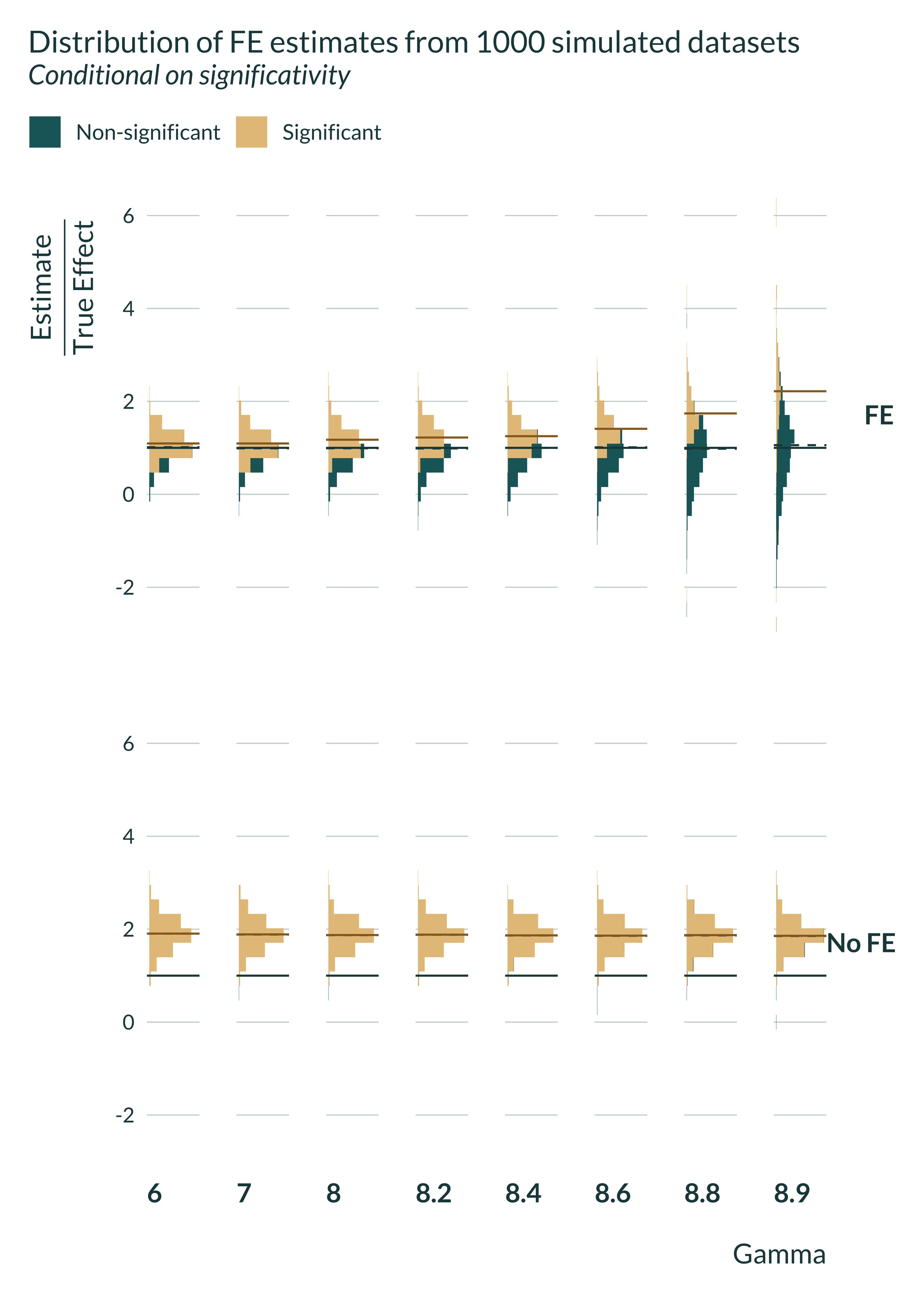
The fixed effects estimator is unbiased and recover, on average, the true effect while the OVB one is biased and does not recovers it. However, since the distribution of the estimator widens with gamma (and power becomes low), conditioning on significance yield different results: including omitted fixed effects can create an exaggeration bias:
Computing bias and exaaggeration ratio
We want to compare \(\mathbb{E}\left[ \left| \frac{\widehat{\beta_{no FE}}}{\beta_1} | \text{signif} \right|\right]\) and \(\mathbb{E}\left[ \left| \frac{\widehat{\beta_{FE}}}{\beta_1} \right| | \text{signif} \right]\). The first term represents the bias and the second term represents the exaggeration ratio.
To do so, I use the function summmarise_sim defined in the functions.R file.
I scale the varying parameter (\(\gamma\)) so that the parameters of interest is more legible and is the proportion of the variation in temperature that is explained by the period fixed-effects.
source(here("functions.R"), echo = TRUE, local = knitr::knit_global())
> summarise_sim <- function(data, varying_params, true_effect) {
+     ungroup(summarise(group_by(data %>% mutate(signif = (p_value <=
+         0.05 .... [TRUNCATED]

> summary_power <- function(data, lint_names = FALSE) {
+     summary_power <- round(summarise(data, median_exagg = median(type_m),
+ `3rd_qu .... [TRUNCATED] Main graph
I then build the main graph of this analysis, describing the evolution of exaggeration with the proportion of the variance in temperature explained by the period fixed-effects.
Show the code used to generate the graph
main_graph <- summary_sim_fe |>
  mutate(
    model_name = ifelse(model == "fe", "Fixed Effects", "No Fixed Effects")
  ) |>
  ggplot(aes(x = prop_fe_var, y = type_m, color = model_name)) +
  geom_line(linewidth = 1.2) +
  scale_mediocre_d() +
  scale_y_continuous(breaks = scales::pretty_breaks(n = 7)) +
  labs(
    x = "Proportion of the variance in temperature explained by the FEs",
    y = expression(paste("Average  ", frac("|Estimate|", "|True Effect|"))),
    color = "Model"
  )

main_graph +
  labs(
    title = "Evolution of bias with the correlation between temperature and FEs",
    subtitle = "For statistically significant estimates, 1000 simulations",
) 
Importantly, note that the explanatory variable of interest in the regression is not the temperature itself the but a dummy equal to one iff the temperature falls into the bin of interest (29, 31]. As a consequence, the fact that variation in temperature are mostly explained by FEs does not mean that it is also the case for our dependent variable of interest.
Further checks
Variance of the variables
I quickly check that the variance of the temperature, production and of the residuals do not vary with gamma:
Show code
| Gamma | Variance Temperature | Variance Production | Variance of u |
|---|---|---|---|
| 6.0 | 79.57 | 2359.32 | 1743.99 |
| 7.0 | 79.04 | 2360.32 | 1745.81 |
| 8.0 | 77.40 | 2366.75 | 1746.50 |
| 8.2 | 78.44 | 2364.42 | 1747.14 |
| 8.4 | 77.88 | 2365.08 | 1747.21 |
| 8.6 | 77.89 | 2370.93 | 1746.96 |
| 8.8 | 78.24 | 2372.76 | 1747.27 |
| 8.9 | 78.20 | 2369.56 | 1746.84 |
Magnitude of exaggeration
To be able to determine where an actual setting could fall on the graph above, I quickly explore the proportion of the variation in temperature coming from within vs between month variation for some example cities.
I implement the decomposition by regressing wet bulb temperature on month fixed effects and computing the variance of the predicted values and residuals.
For New York and San Diego, I use the data introduced above. I also implement this decomposition for the Indian capital, New Delhi, as Somanathan et al. (2021) focuses on this country. I did not hand-picked the city, just focused on the capital; one could probably identify cities that display more between-months variation. The data comes from Dong et al. (2022) and can be accessed here.2 Using the same data, I computed the same analysis for all weather stations and find, at the top of the distribution, stations for which about 94% of the variation in wet bulb temperature is explained by between months variation.3.
Show code
decompose_var <- function(data, indep_var) {
  reg <- data |>
    feols(as.formula(paste(indep_var, "~ -1 | period")))

  tibble(
    var_between = var(predict(reg)),
    var_within  = var(resid(reg)),
    var_total   = var(data[[indep_var]], na.rm = TRUE),
    share_between = var_between / var_total,
    share_within  = var_within  / var_total
  )
}

#share of temp explained by FEs
temp_data_ex <- small_temp_data |>
  mutate(
    in_bin = (wbg_tmax_c > 29 & wbg_tmax_c <= 31),
    period = floor_date(date, "month")
  )

# New York
decomp_ny <- temp_data_ex |>
  filter(county_name == "New York") |>
  decompose_var("wbg_tmax_c") |>
  mutate(region = "New York", .before = 1)

#San Diego
decomp_sd <- temp_data_ex |>
  filter(county_name == "San Diego") |>
  decompose_var("wbg_tmax_c") |>
  mutate(region = "San Diego", .before = 1)

#New Delhi
nc_newdelhi <-
  nc_open(here("inputs", "FE_temperature", "GSDM-WBT_421820-99999_19810101-20201231.nc"))
names(nc_newdelhi$var)
[1] "WBT" "flag"Show code
names(nc_newdelhi$dim)[1] "time"Show code
wbt <- ncvar_get(nc_newdelhi, "WBT")
measure_time <- nc_newdelhi$dim$time$vals
measure_date <- as_date(measure_time, origin = "1981-01-01")

temp_delhi <- tibble(date = measure_date, wbt) |>
  mutate(
    period = floor_date(date, unit = "month"),
    wbt = as.double(wbt)
  )

decomp_delhi <- decompose_var(temp_delhi, "wbt") |>
  mutate(region = "New Delhi")

bind_rows(decomp_sd, decomp_ny, decomp_delhi) |>
  select(region, starts_with("share")) |>
  kable(
    col.names = c(
      "Region",
      "Between-months variation (share)",
      "Within-month variation (share)"
    )
)| Region | Between-months variation (share) | Within-month variation (share) |
|---|---|---|
| San Diego | 0.6793151 | 0.3206849 |
| New York | 0.8084893 | 0.1915107 |
| New Delhi | 0.8867553 | 0.1131557 |
We can now compare that to our results and see where these cities would fall:
Show code
| Gamma | Between-months variation (theorical share) | Power | Exaggeration | Median SNR |
|---|---|---|---|---|
| 6.0 | 0.444 | 84.300 | 1.086 | 3.011 |
| 7.0 | 0.605 | 82.100 | 1.118 | 2.958 |
| 8.0 | 0.790 | 71.000 | 1.180 | 2.596 |
| 8.2 | 0.830 | 66.500 | 1.188 | 2.414 |
| 8.4 | 0.871 | 61.600 | 1.285 | 2.314 |
| 8.6 | 0.913 | 49.400 | 1.415 | 1.984 |
| 8.8 | 0.956 | 31.231 | 1.768 | 1.433 |
| 8.9 | 0.978 | 17.470 | 2.323 | 1.099 |
Based on this analysis, we can expect month fixed effects to lead to an exaggeration going up to 1.3. However, note that the simulations here largely simplify the reality and that the inclusion of other fixed effects, such as location ones, or controls more correlated with temperature than with productivity would further exaggerate exaggeration. This number is therefore likely a lower bound of possible exaggeration in this setting.
In addition, here, the dependent variable is not the temperature per se but a dummy equal to 1 if the temperature falls into a given bin. As such, when the variance of temperature is large enough, this variance is roughly equal to 1/3, the variance of a uniform distribution over the interval (29, 31] and does not vary much with the variance of the underlying distribution when that variance is large enough. In other settings, where the dependent variable is directly correlated with the fixed effects, we may expect them to more strongly affect exaggeration.
Representativeness of the estimation
I calibrated the simulations to emulate a typical study from this literature. To further check that the results are realistic, I compare the average Signal-to-Noise Ratio (SNR) of the regressions from the simulations to the range of \(t\)-stat of existing studies investigating similar questions.
In Somanathan et al. (2021), the \(t\)-stats (in table 2) varies between 0.17 and 3.75. In LoPalo (2023), in table 2, 3, 5 and A4, the \(t\)-stats for the estimates of interest varies between 0.5 and 4 (and actually even 0.03 for South Asia in the heterogenity analysis). Stevens (2017) report \(t\)-stats varying between 0.5 and 2.5 (in table 2).
As shown in the previous table, I find SNRs in a similar range and corresponding to substantial exaggeration ratios.