Show packages used in this document
library(tidyverse)
library(knitr)
library(mediocrethemes)
library(here)
library(retrodesign)
library(haven)
library(DT)
library(ggbeeswarm)

set_mediocre_all(pal = "coty")
First, I load the dataset containing results of the meta-analysis. I then print the whole table:
Compare to the literature review in Shah et al. (2016)
The goal is to compare the OVB in a non-causal case to exaggeration of a corresponding causal analysis. To do so, I focus on IVs because for the same design, they report both a “naive” OLS estimate and a causal one. To disentangle the biases of exaggeration and omitted variables, I make the following hypotheses:
- The OLS estimator is not subject to exaggeration. For each study, I assume that the distribution of estimates we draw from is a normal centered on the true effect plus/minus bias and with a standard deviation equal to the standard error of the OLS estimator.
- The IV estimator is unbiased. However, for each study, I assume that we do not draw estimates from this entire distribution centered on the true effect but from the subsample of estimates that are statistically significant, i.e. the tails of this normal distribution centered on the true effect and with a standard error equal to that of the IV estimator.
To be able to compare this exaggeration and OVB, I need to have an estimate of the “true effect”. That way I can compare how far are the OLS and IV point estimates from this true effect and to compute the mean exaggeration.
True effect as in Shah et al. (2016)
First, I define the true effect based on a meta-analysis carried out in Shah et al. (2016). They find the following impact of standardized increments in pollutant concentration on relative risk for mortality and hospital admissions (CI = 95% CIs):
- \(CO\): 1.015 per 1 ppm (1.004 to 1.026),
- \(SO_2\): 1.019 per 10 ppb (1.011 to 1.027),
- \(NO_2\): 1.014 per 10 ppb (1.009 to 1.019),
- \(PM_{2.5}\): 1.011 per 10 \(\mu g/m^{3}\) (1.011 to 1.012),
- \(PM_{10}\): 1.003 per 10 \(\mu g/m^{3}\) (1.002 to 1.004),
- \(0_3\): 1.001 per 10 ppb (1.000 to 1.002)
I then restrict the sample to studies that consider treatments that can be compared to these standardized increments (thus removing for instance treatments such as “1 additional fog day”).
I also restrict the sample to IV and their corresponding OLS (or conventional time series) in order to be able to compare a a “causal” method to a naive one.
method_interest <-  c("conventional time series", "instrumental variable")
pollutant_interest <- c("co", "no2", "o3", "ozone", "pm10", "pm2.5")

#there might be an issue with the increase_independent_variable for CO
estimates_interest <- data_lit_review |>
  filter(empirical_strategy %in% method_interest) |>
  filter(independent_variable %in% pollutant_interest) |>
  filter(str_detect(increase_independent_variable, "ppb|µg")) |>
  mutate(
    independent_variable =
      ifelse(independent_variable == "ozone", "o3", independent_variable)
  )
In the literature review the studies consider various increases in the independent variable. They are as follows (with the number of study for each pollutant):
| increase_independent_variable | n |
|---|---|
| 1 ppb increase in co | 40 |
| 1 ppb increase in no2 | 29 |
| 1 ppb increase in o3 | 2 |
| 1 µg/m³ increase in no2 | 22 |
| 1 µg/m³ increase in pm10 | 91 |
| 1 µg/m³ increase in pm2.5 | 63 |
| 1 µg/m³ reduction in pm2.5 | 3 |
They differ from those in Shah et al. I modify those in Shah, to make them comparable to mine. To do so I assume linearity and for instance divide the effects by 10 and the effects for \(CO\) by 1000:
#there is an issue here with the / 10 thing
effects_shah <-
tibble(
pollutant = c("co", "so2", "no2", "pm2.5", "pm10", "o3"),
rr_shah = c(1.015, 1.019, 1.014, 1.011, 1.003, 1.001)
) |>
mutate(effect_shah = (rr_shah - 1)*100) |>
mutate(
effect_shah = ifelse(
pollutant == "co",
effect_shah / 1000,
effect_shah / 10
)
) |>
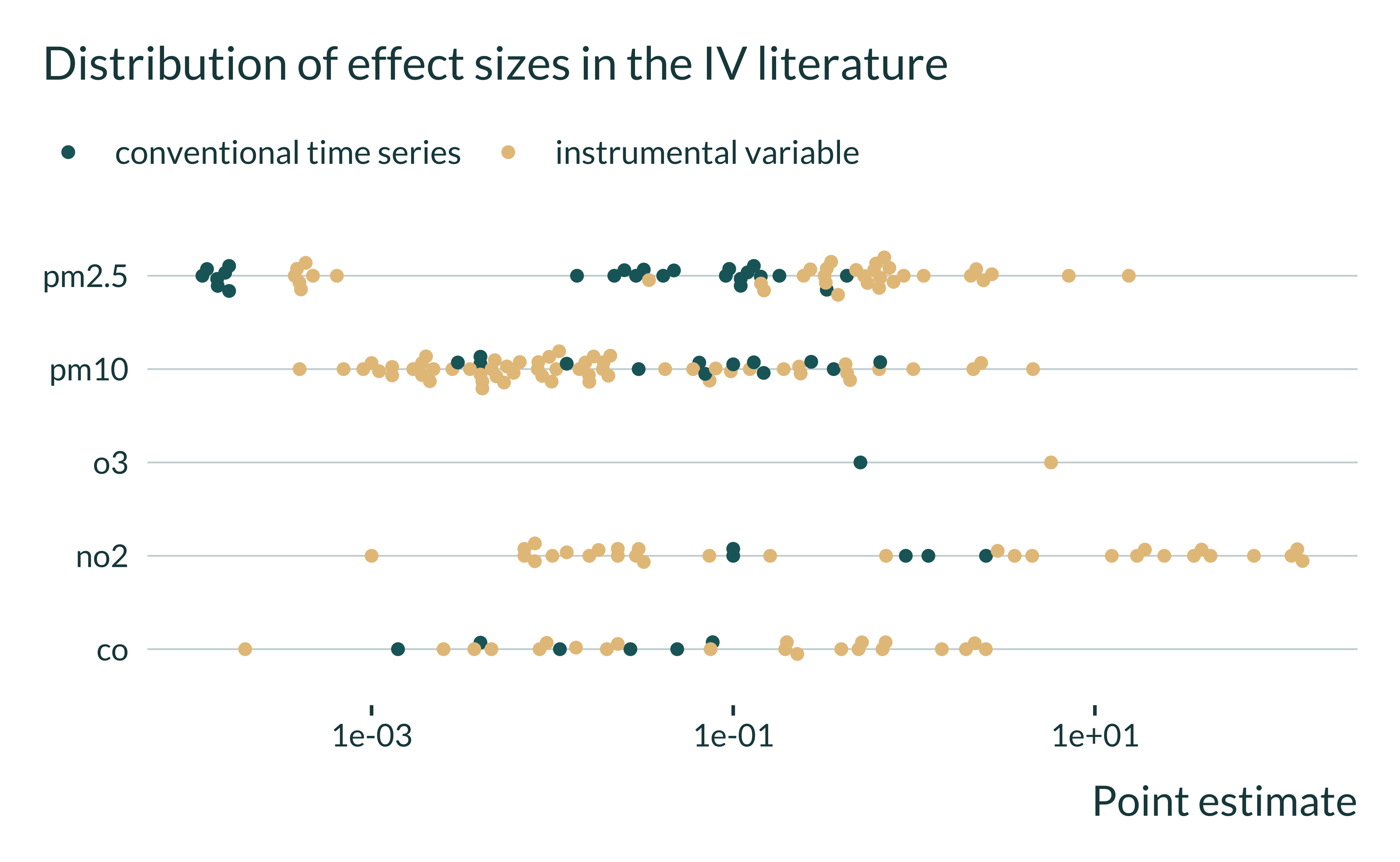
select(-rr_shah)I also check the distribution of the effect sizes found in each analysis of the restricted sample of the literature review, using a log 10 scale for the x-axis:
Show the code used to generate the graph
estimates_interest |>
  filter(empirical_strategy %in% c("conventional time series", "instrumental variable")) |>
  filter(control_outcome == 0) |> #remove placebos
  ggplot(aes(x = estimate, y = independent_variable, color = empirical_strategy)) +
  # geom_histogram(bins = 10) +
  geom_beeswarm(cex = 1.5) +
  # facet_wrap(~ independent_variable, scales = "free") +
  scale_x_log10() +
  labs(
    title = "Distribution of effect sizes in the IV literature",
    x = "Point estimate",
    y = NULL,
    color = NULL
  )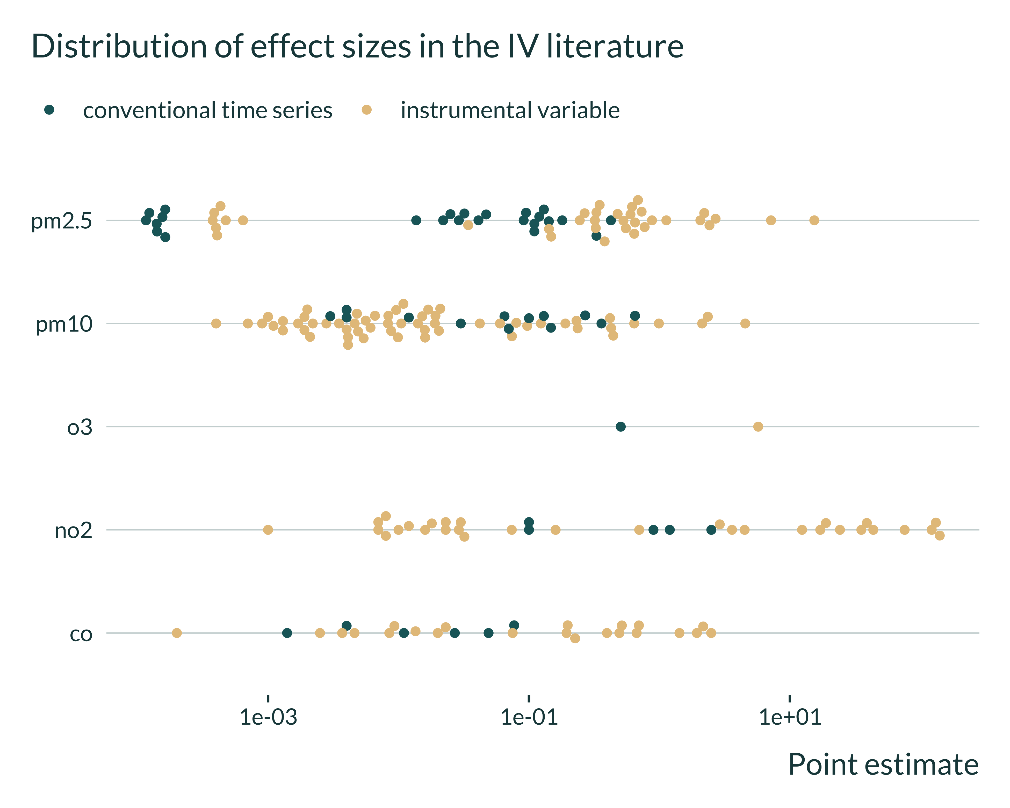
It seems that the magnitude of the estimates vary a lot from study to study.
estimates_interest |>
  filter(empirical_strategy %in% c("conventional time series", "instrumental variable")) |>
  filter(control_outcome == 0) |> #remove placebos
  ggplot(aes(x = estimate, y = independent_variable, color = empirical_strategy)) +
  # geom_histogram(bins = 10) +
  geom_beeswarm(cex = 1.5) +
  # facet_wrap(~ independent_variable, scales = "free") +
  scale_x_log10() +
  labs(
    title = "Distribution of effect sizes in the IV literature",
    x = "Point estimate",
    y = NULL,
    color = NULL
  )
Example of He et al (2020)
I then study the case of He et al (2020). They find that ” a 10 μg/m3 increase in PM2.5 increases mortality by 3.25%” (se 1.43%). Their OLS results suggest a 0.32% increase (sd 0.23%). Deryugina et al (2019) find that “each 1 μg/m3 increase in daily PM 2.5 exposure causes […] a 0.18 percent increase relative to the average three-day mortality rate”. I explore whether the findings in He et al. IV could be exaggeration if the true effecct was equal to the one found in Deryugina.
true_deryugina <- 0.18
true_shah <- 0.11
estimate_iv_he <- 0.325
se_iv_he <- 0.143
estimate_ols_he <- 0.032
se_ols_he <- 0.023
N <- 100000
estimates_he <-
tibble(true_deryugina, true_shah, estimate_iv_he, estimate_ols_he) |>
mutate(
exagg_iv_he_deryugina =
true_deryugina * retrodesign(true_deryugina, se_iv_he)$type_m,
exagg_iv_he_shah =
true_shah * retrodesign(true_shah, se_iv_he)$type_m
)
#comparison exagg ovb
exagg_ovb_shah <-
abs(true_shah - estimates_he$exagg_iv_he_shah) /
abs(true_shah - estimate_ols_he)
exagg_ovb_deryugina <-
abs(true_deryugina - estimates_he$exagg_iv_he_deryugina) /
abs(true_deryugina - estimate_ols_he)
# estimates_he |>
# pivot_longer(cols = everything(), names_to = "name", values_to = "estimate") |>
# filter(!str_detect(name, "shah")) |>
# ggplot(aes(x = estimate, y = 0, color = name)) +
# geom_point(size = 3) +
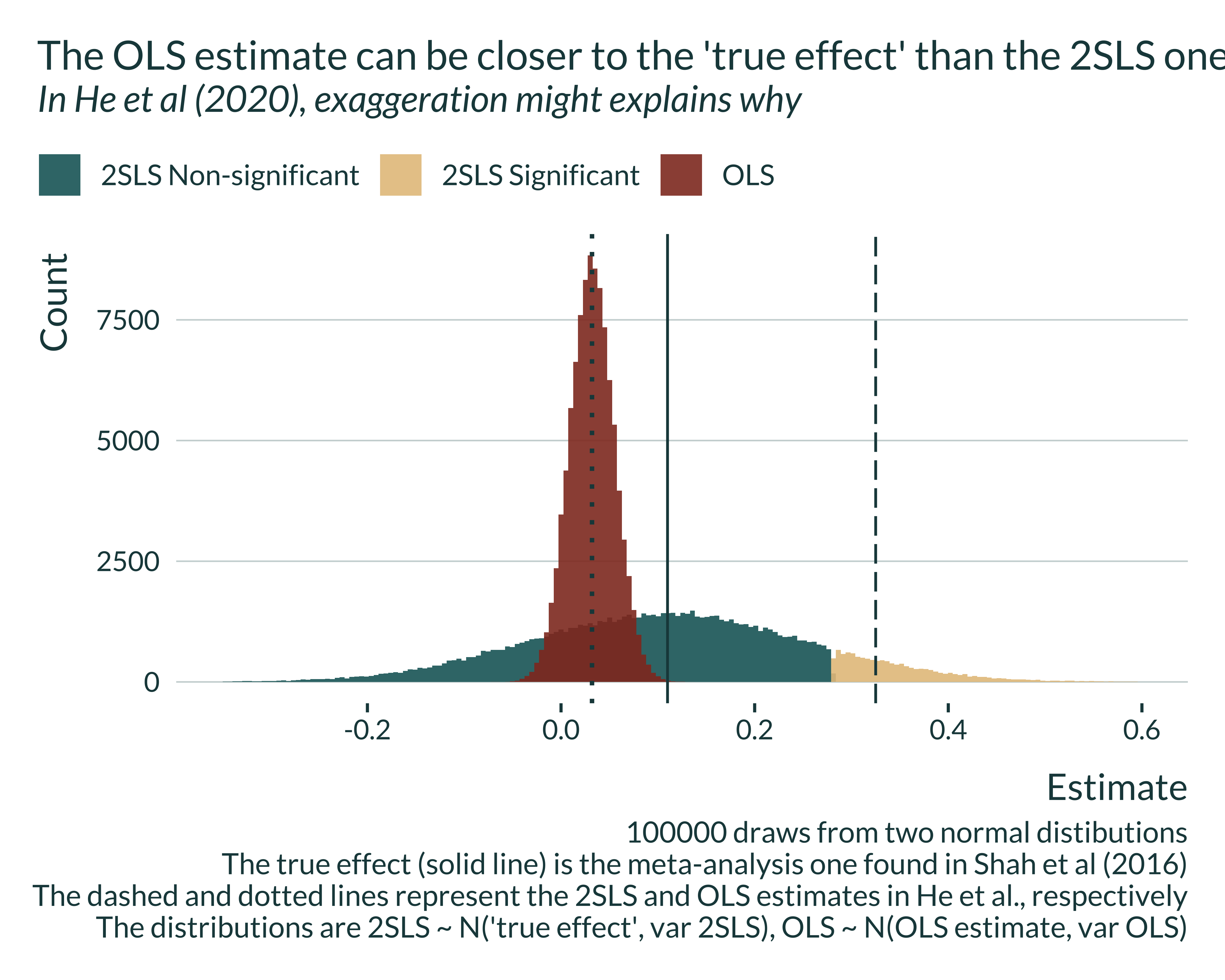
# xlab(c(0, NA))I then plot the distribution of the OLS estimator, assuming that the point estimate found in He et al. (2020) is at the center of this distribution. I also plot the distribution of the 2SLS estimator of He et al. (2020) that would be obtained if the IV was centered on the true effect (as defined in Shah et al. (2016)). The standard deviation of this distribution is equal to the standard error of the 2SLS estimator of He et al. (2020).
Show the code used to generate the graph
distrib_he_shah <-
  tibble(
    OLS = rnorm(N, estimate_ols_he, se_ols_he),
    IV = rnorm(N, true_shah, se_iv_he)
  ) |>
  pivot_longer(cols = everything(), names_to = "model", values_to = "estimate") |>
  mutate(
    se = ifelse(model == "ols", se_ols_he, se_iv_he),
    signif = (estimate > 1.96*se)
  )

he_graph <- distrib_he_shah |>
  mutate(
    cat = ifelse(signif, "2SLS Significant", "2SLS Non-significant"),
    cat = ifelse(model == "OLS", "OLS", cat)
  ) |>
  ggplot(aes(x = estimate, fill = cat)) +
  geom_histogram(bins = 190, position = "identity", alpha  = 0.9) +
  # geom_area(stat = "bin", bins = 100, position = "identity", alpha  = 0.9) +
  geom_vline(xintercept = true_shah, linetype = "solid") +
  geom_vline(xintercept = estimate_iv_he, linetype = "longdash") +
  geom_vline(
    xintercept = estimate_ols_he,
    linetype = "dotted",
    linewidth = 0.8
    # color = "#E08E53"
  ) +
  # facet_wrap(~ model_desc, nrow = 2) +
  labs(
    x = "Estimate",
    y = "Count",
    fill = NULL
  ) +
  xlim(c(-0.35, 0.6))

ggsave(here("images", "air_pollution", "graph_he.pdf"), he_graph, width = 8, height = 4)

he_graph +
  labs(
    title = "The OLS estimate can be closer to the 'true effect' than the 2SLS one",
    subtitle = "In He et al (2020), exaggeration might explains why",
    caption = "100000 draws from two normal distibutions
              The true effect (solid line) is the meta-analysis one found in Shah et al (2016)
              The dashed and dotted lines represent the 2SLS and OLS estimates in He et al., respectively
              The distributions are 2SLS ~ N('true effect', var 2SLS), OLS ~ N(OLS estimate, var OLS)"
  )
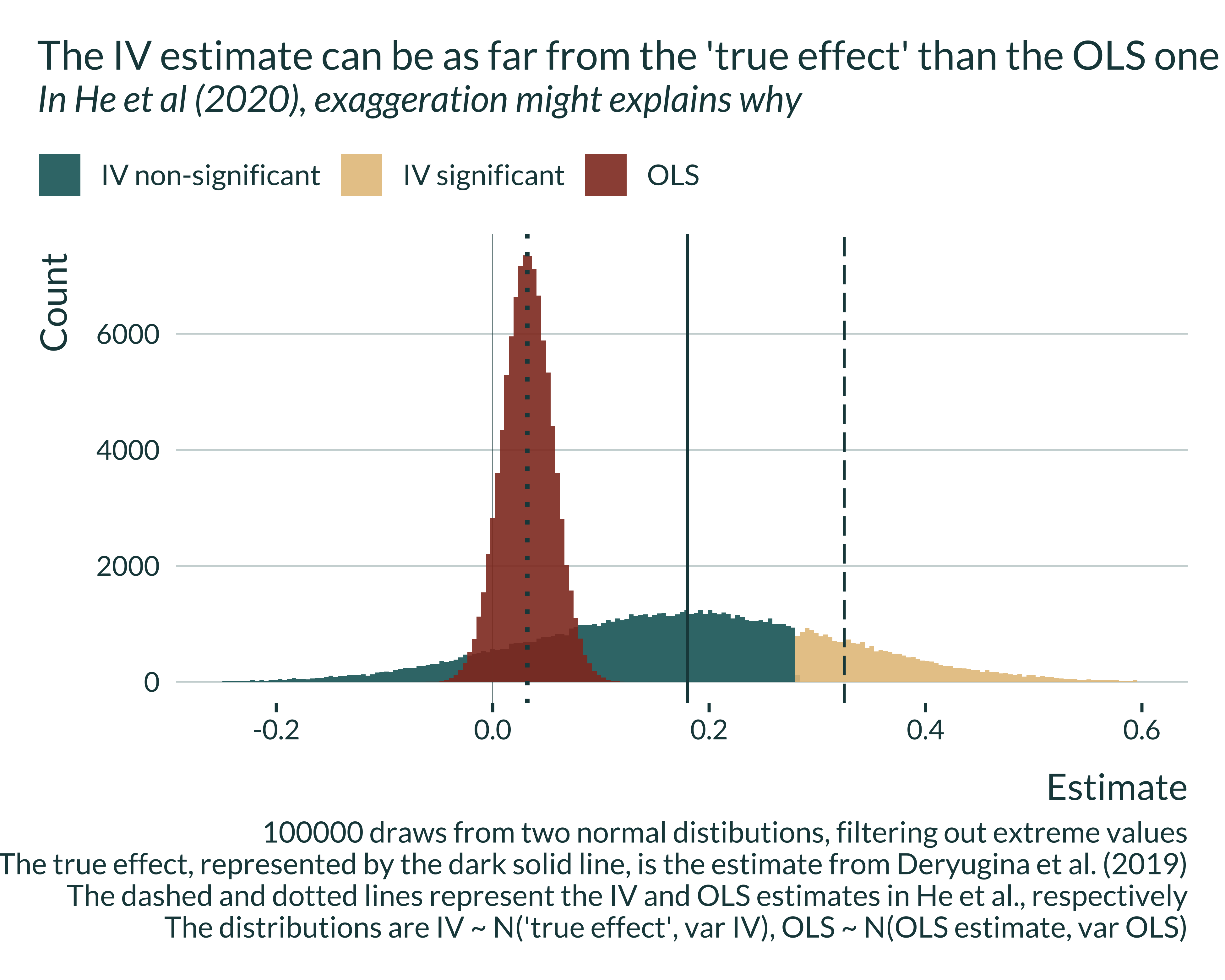
I then plot the same graph if the true effect was the one found in Deryugina et al. (2019):
Show the code used to generate the graph
distrib_he_deryugina <-
  tibble(
    OLS = rnorm(N, estimate_ols_he, se_ols_he),
    IV = rnorm(N, true_deryugina, se_iv_he)
  ) |>
  pivot_longer(cols = everything(), names_to = "model", values_to = "estimate") |>
  mutate(
    se = ifelse(model == "ols", se_ols_he, se_iv_he),
    signif = (estimate > 1.96*se)
  )

he_graph_deryugina <- distrib_he_deryugina |>
  mutate(
    signif = ifelse(signif, "IV significant", "IV non-significant"),
    cat = ifelse(model == "OLS", "OLS", signif),
    model_desc = ifelse(
      model == "IV",
      "IV ~ N('true effect', var IV)",
      "OLS ~ N(OLS estimate, var OLS)")
  ) |>
  ggplot(aes(x = estimate, fill = cat)) +
  geom_vline(xintercept = 0, linetype = "solid", linewidth = 0.1) +
  geom_histogram(bins = 200, position = "identity", alpha  = 0.9) +
  # geom_area(stat = "bin", bins = 183, position = "identity", alpha  = 0.9) +
  geom_vline(xintercept = true_deryugina, linetype = "solid") +
  geom_vline(xintercept = estimate_iv_he, linetype = "longdash") +
  geom_vline(
    xintercept = estimate_ols_he,
    linetype = "dotted",
    linewidth = 0.8
    # color = "white"
  ) +
  # facet_wrap(~ model_desc, nrow = 2) +
  labs(
    x = "Estimate",
    y = "Count",
    fill = NULL,
    color = NULL
  ) +
  xlim(c(-0.25, 0.6))


ggsave(
  here("images", "air_pollution", "he_graph_deryugina.pdf"),
  he_graph_deryugina,
  width = 8, height = 3.5
)

he_graph_deryugina +
  labs(
    title = "The IV estimate can be as far from the 'true effect' than the OLS one",
    subtitle = "In He et al (2020), exaggeration might explains why",
    caption = "100000 draws from two normal distibutions, filtering out extreme values
              The true effect, represented by the dark solid line, is the estimate from Deryugina et al. (2019)
              The dashed and dotted lines represent the IV and OLS estimates in He et al., respectively
              The distributions are IV ~ N('true effect', var IV), OLS ~ N(OLS estimate, var OLS)"
  )